Minimal Graphic Design | Key Elements & Kickass Examples
Minimal graphic design is one of the most effective, eye-catching art styles you can use for your company’s branding. It’s become the default style for many modern brands—Google, Apple, Nike, Uber, and Nike to name a few, who use it for their logos, products, websites, and adverts. The style seems to be perfectly suited for businesses that sell products and services.
In this article, we explore the history and definition of minimal graphic design and the key design elements that define it. We’ll provide plenty of real-world business examples along the way, including adverts, website and app designs, email campaigns, and more. By the time you’re done, you should have a good overview of how to create your own minimal graphic design.
What is minimal graphic design?
Minimal graphic design is an art style that uses limited elements, lots of negative space, and a small colour palette. Every element in the design should have purpose, and be nicely balanced to achieve a sense of symmetry.
The main idea behind minimal graphic design is to emphasise the few crucial elements that are used, which are important by themselves without the need for unnecessary embellishment. It can be characterised by the credo “less is more,” which leads to everything in the design being there for a distinct purpose. Nothing is superfluous; everything is meaningful.
Minimal design (also known as “literalist art” and “ABC Art”) comes from the minimalist movement, which started in New York City in the early 60s. It was supposedly influenced by a distaste of Action painting, which emphasised spontaneity and the free-flowing brush strokes as seen in the Abstract Expressionism of Jackson Pollock’s work. It was also influenced by the Dutch De Stijl movement (also called Neoplasticism), which tends to be stripped down, geometric, and uses small primary colours like red, yellow, and blue. This movement was also an opposing reaction to an art style, this time the vivid Art Deco style which dominated the early 20th century.
The first piece of minimalist art is believed to be by Russian painter Kasimir Malevich in 1915, who created a simple black square on a white background as a way to express the supremacy of colour and shape alone. According to modern art gallery Tate, it’s the first time that someone made a painting that wasn’t of something.1
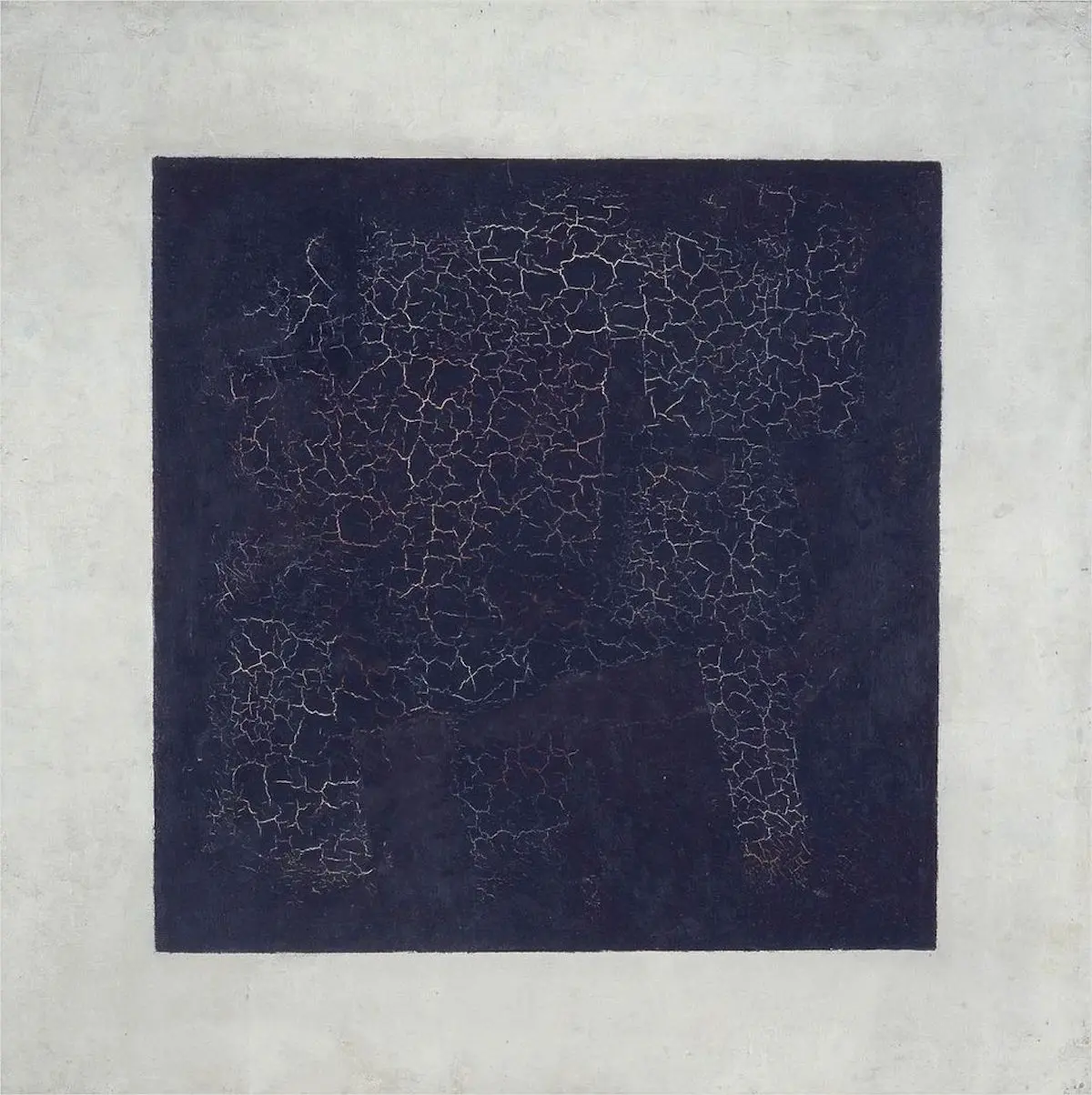
The very first minimalist sculptors and artists include Donald Judd, Carl Andre, Dan Flavin, Agnes Martin, Frank Stella, and Anne Truitt. These and other minimalist artists wanted to remove any subjective meaning or interpretation from their art, and make the art itself the focus. The idea was to produce a strong emotional response that didn’t need to be “worked out”—it just hit you. The sheer simplicity of the art and the gorgeous balance of its elements was the whole point, without the need to furrow your brow and extrapolate a personal meaning. Minimalist design is all about experiencing these essential elements. It’s a literal, objective approach to art design, strongly influenced by the Bauhaus art schools in Germany—one of the most influential modernist design schools of the 20th century.
Today, minimal graphic design is one of the most common styles used by Western companies, whose branding, product packaging, and websites are given a clean, minimalist style that is appealing to millions of people. It’s also used in adverts, email marketing, social marketing, and user interfaces. The gradual simplification of brand logos is evidence of the ongoing graphic design trend towards minimalism, displayed proudly in the company’s brand style guide.
The style has also influenced much of our modern world, including furniture (think IKEA), architecture, cars, and city design.
Key elements in minimalism graphic design
When you look at a piece of minimalist graphic design, you can expect to see few elements, a limited colour palette, and a strong sense of balance. It might make you feel a sense of clarity, even peace. That’s why it’s so popular for websites and software apps, which can seem straightforward and appealing while bristling with complex functionality behind the scenes.
These are the key elements that you can expect to find for minimalism in graphic design:
1. Simple, clean design with lots of negative space
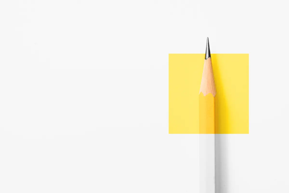
Simplicity is probably the most obvious characteristic of minimal graphic design. It tends to use few elements and lots of negative space, which attracts the viewer’s gaze to the objects and intensifies them. Apple are famous for this style—the packaging for a new Macbook Pro contains just a single image on the front: the laptop itself. The machine is a beautiful piece of design by itself, and Apple flaunts this on its packaging by using these minimalist design principles. It does the same on its website, where the product pages usually showcase the image of the product itself in glorious full-screen fashion, as shown below.
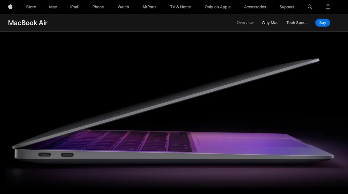
By adopting a clean design with carefully-chosen, essential elements, they have a much bigger impact on the viewer, and are more memorable as a result. That’s why minimalism has become the design style of choice for so many modern companies. It allows them to showcase their products and services with crisp simplicity.
Negative space in a minimalist design is often white or black, but doesn’t have to be. As long as the space highlights the key elements of the design, any colour works, as shown in the quirky flamingo-office-worker image below. This is a good example of combining minimalist design principles with surrealism to provide an almost shocking effect that is more likely to grab people’s attention—perfect for adverts.

2. Purposeful elements
Because cleanliness is essential for minimalist design, the number of elements that you can use are limited, and so they must have a genuine purpose. In theory, the fewer elements that are used on the page, the easier the design is to comprehend and the more impactful it will be. A quote from French writer and aviator Antoine de Saint might guide us when creating minimal graphic design:
“Perfection is achieved, not when there is nothing more to add, but when there is nothing left to take away.”
—Antoine de Saint
If your design is packed with shapes and colour with no direction or significance, you’re probably on the wrong track. Be ruthless with taking stuff away, and you may eventually end up with something strikingly uncomplicated, and truly minimalist.
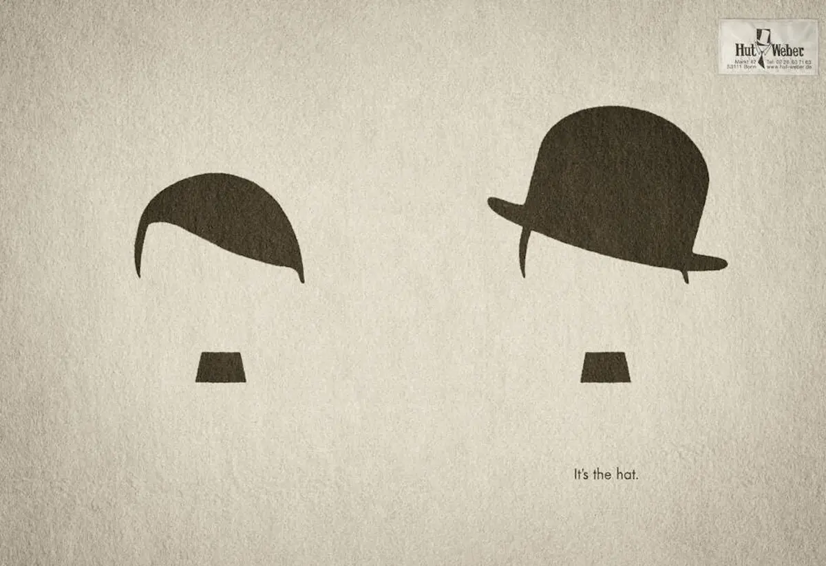
Take this genius advert from German hat company Hut Weber, designed by ad agency Service Plan. With two simple images, they’ve highlighted a key difference between Charlie Chaplin and Hitler—the hat. It’s communicating the idea that a hat has the power to turn bad into good, and it does it with just a few black shapes and some text on a clean background. This advert would have been cheap to print too because of the lack of ink.
We can turn to our own e-magazine—Powered Up—for another example. While this design may use a few too many colours to be truly minimalist, we ensure that every element has a purpose, which gives a clear sense of importance and what should be focused on. It works well: we consistently achieve high click and open rates for our email marketing. Click here if you’d like to subscribe!
Powered Up edition, May 2022—an example of using purposeful elements to create focus and clarity
3. Few colours
The more colours that a design uses, the noisier it seems. Psychedelic design is a good example of a style that uses lots of colours to create an intense, trippy effect that mimics the experience of taking LSD. Minimal graphic design is the polar opposite, with scarce, carefully chosen elements that make a statement, and limited colours to deepen the effect.
Traditional minimalist art tended to use flat, single-hued colours, as shown in the example below. But the style has since evolved, and modern minimalist designers will happily use colour gradients and textures provided they maintain a clean look, and help to achieve the desired emotional effect.
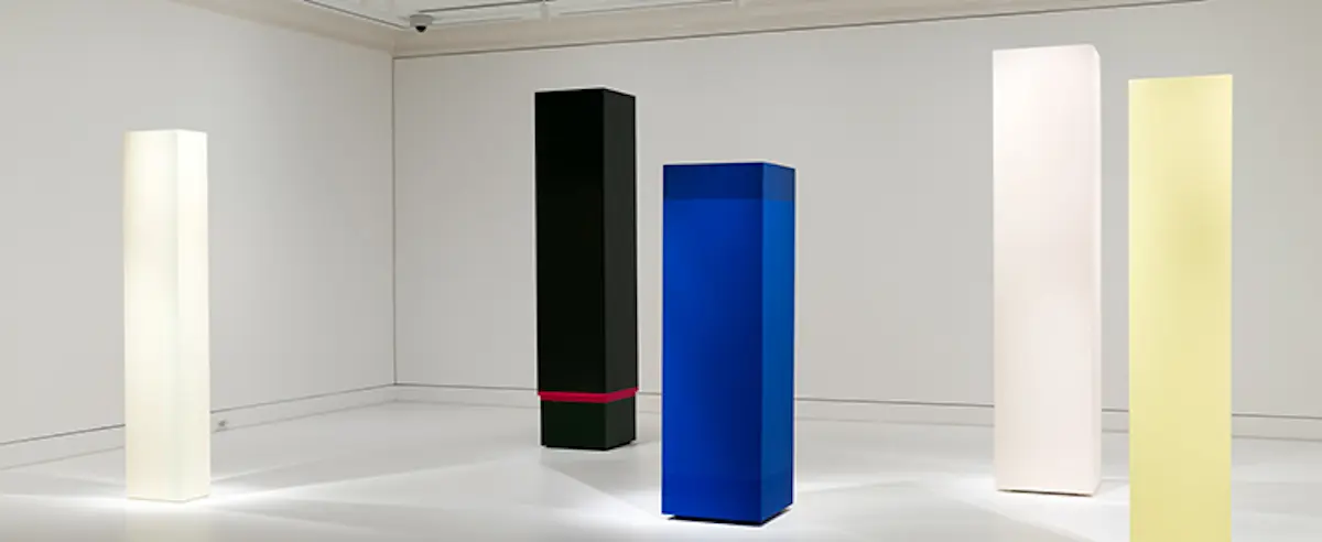
This example from designer Tom Anderson is a beautiful example of using simple colour in a minimalist design to promote the stylish bags of Sanqvist. The stark contrast between the white space on the left and the colour on the right is almost startling, and creates a genuine “wow” effect that promotes the products effectively. Choosing colour (or lack of) that creates clear contrast is an important aspect of minimal design, and Anderson has achieved it with exceptional skill.
Animated image from Tom Anderson on Dribble
4. Balance
Minimalist design tends to be well balanced, but not necessarily symmetrical. On a web page, a thick, bold headline might be balanced with an image. Or a logo might be balanced with a menu button. The example below shows a superbly balanced minimalist homepage design that uses a combination of graphics, text, and UI elements.
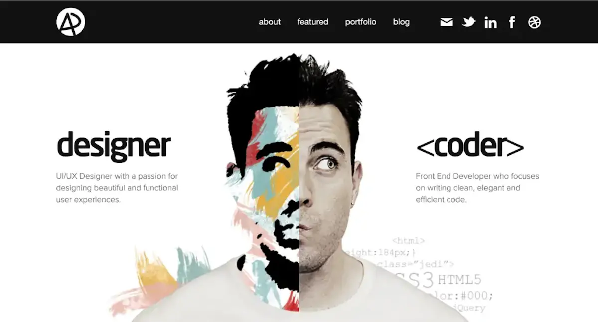
Balance can be achieved by using an invisible “grid” system which makes it easier to achieve a sense of symmetry. Modern websites tend to use actual grid systems to display the elements on each page, because it makes things much easier for developers and achieves a more pleasing look. Balance can also help to establish a clear visual hierarchy, allowing the user to comprehend the importance of each section and element on the page.
On artistic pieces, balance could be achieved with a combination of colour and shapes, as shown in this clever piece below.
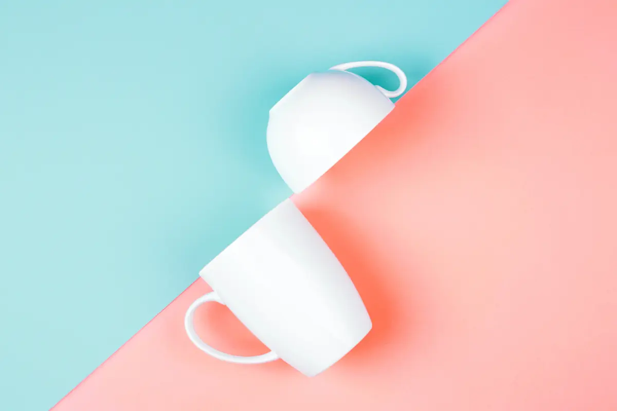
As humans, we unconsciously associate symmetry with the order of the natural world, with its perfectly balanced seashells, sunflowers, and dogs. This can make symmetry feel incredibly soothing—we recognise it, understand it, and feel a sense of control over it. Minimalist designers tap into this feeling by balancing colour, imagery, and shape, which can evoke a feeling of calmness and encourage us to purchase whatever is being sold.
5. Simple typography
Minimalist graphic design usually opts for clean, sans-serif typography that is easy to scan or read. The letters have a consistent x-height and use plenty of line spacing. Some examples include Open Sans, Roboto, and PT Sans from Google’s font library, as well as classics like Helvetica and Futura. There can be a variety of font weights in minimalist graphics, provided the design remains neat, graceful, and balanced.
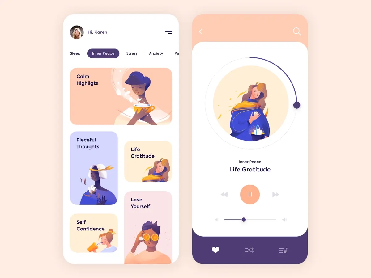
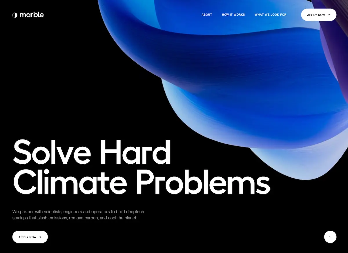
One font is typically chosen for the design, although two can be used for different types of material, specifically website designs, app designs, and adverts where there’s a combination of headings and body text. You can see this in the example website below, which uses a thick, bold headline font, and a lighter font directly underneath (although the font is very similar in this example).
Captivating imagery
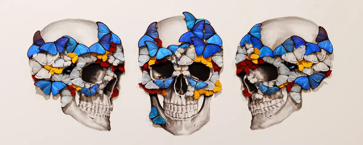
Images, shapes, and other elements are supposed to be the main focus in minimalist graphic design, and to make them more interesting, it’s common for designers to use fascinating or startling subjects. When an image like this is surrounded by negative space and thrust into the centre of the stage, the effect can be mesmerising and help to achieve the goals of the design.

This technique can be most effective when used in pieces that need to draw people’s attention, like adverts, social posts, and email marketing. When you’re scanning hundreds of images each day, a captivating image can be the difference between a winning or losing advert.
Minimal graphic design—summary
Minimal graphic design is one of the most popular styles used by modern businesses. Its clean, focused design style is ideal for companies who want to sell their products and services, with their customers experiencing the style as appealing and engaging. We hope you enjoyed this article, and that it helps you to produce some killer minimalist designs of your own. Thanks for reading!


