What Makes A Best Practice Contact Us Page? [+10 Examples]
Your contact us page is arguably one of the most important pages on your website. For a new prospect, it’s often the first place they go after they’ve decided to purchase from you, after which they become a qualified lead and perhaps a future customer. If the contact form is difficult to use, they’ll give up, with a sale lost forever.
The contact page itself also serves as a portal to get more information—grabbing your phone number, your office location, or perhaps getting help for one of your products.
So given its importance, what makes a best practice contact us page? In this article, we’ll explore the most effective ways to design your page, and provide you with ten excellent examples of high-converting contact pages.
What do your users want from your contact us page?
This may seem obvious, but even the most experienced designers and developers are prone to forget: a web page is for the person who is going to be using it, not for the person who creates it. When we lay out our contact us page, it’s easy to add the elements that we think will work best, without really considering what’s most important to the user—without implementing the UX tips and tricks that will make the page awesome. This often results in a low-converting contact page (check out our article on How To Improve CTR for your pages).
To design a best practice contact us page, it’s absolutely critical to identify the needs of your customers. Every company is unique, so the needs of your particular users will also be unique. A small B2C company that builds houses for locals will need a different kind of contact page than a large company that provides software to businesses. The building firm might just need a simple enquiry form, phone number, and company address, whereas the software company might want to guide the user through a list of questions before presenting them with a form so that they can quickly find the answer themselves without having to take precious support time.
For this reason, before you design your contact page, it’s essential to need to think about the most common things your users want to do, and prioritise the design based on that. If you have the resources, you might consider asking your existing customers what they want out of your contact page, through surveys or brief interviews (this is also a great way to identify customer needs).
There’s a surprising number of things that a user might want to do on a contact page, with the most common including:
- Getting in touch by calling or emailing you
- Finding an answer to a question
- Booking a demonstration of your product
- Finding the contact info for a particular department or member of staff
- Finding out where you’re located, so they can visit for a meeting. Also figuring out where to park when they visit.
- Finding out your work hours
- Following you on social media
This doesn’t mean to say you should stuff your contact page with every possible feature. You’ll need to find a balance between the most important features to your users, and keeping the page as clean and uncluttered as possible.
You can use the list above to create a rough wireframe for your page (just a simple sketch will do), with the most common uses appearing first. Once you have your wireframe, you can then find a contact page template that matches closely enough, or have a web designer create a custom page for you. But be sure to stick to the best practices that follow.
Best practices for your contact us page
Now that you have a basic idea of what your users want when they visit your page, we can talk about how to design a best practice contact us page that is super easy to use.design principles that will make your page easy to use.
1. The right-sized contact form
Every type of form, whether on the web or a piece of paper, should be the exact length it needs to be. Add unnecessary fields, and you’re reducing the likelihood of the form being completed, which is the single most important goal for most contact pages.
When you’re creating your contact form, only include fields that are absolutely necessary for your business. At a bare minimum, you’ll probably want to include:
- Name
- Enquiry/message
For larger companies, you may need a “Type of enquiry” dropdown that directs the enquiry to the correct department. Or you may want to separate the “name” field into “first name” and “last name,” so that you can market to them in a more personal way going forward.
Whichever fields you include, make sure there’s a solid business reason for them.
It’s also helpful to let the user know how long you take to respond to enquiries, because if the query is urgent, they may decide to call instead.
2. A usable contact us page form
This is possibly the most crucial best practice for a contact us page. Forms are one of the most important pieces of functionality on the web, and as a result, there’s plenty of associated design principles that can either make or break them. The perfect form is one that doesn’t present any problems to the user, gently guiding them through the filling out process, and giving them a sense of satisfaction when they’re done. If you can create this type of form for your contact page, you’ll receive more enquiries from your prospects and customers.
Some key design principles for forms include:
- Display your form in a single column, as these are easier to complete than multi-column forms (an exception is related fields such as “first name” and “last name,” which can sit side-by-side).
- Make the submit button highly contrasting or bright, so that it’s impossible to miss. You can check this with the “squint test”—squint at the page, and if the button is clearly visible, it’s a good one.
- Make the form labels as simple and clear as possible, removing any unnecessary words (a common example is using just “email” instead of “email address.”)
- Use permanent labels that sit outside the form field, so that they don’t disappear once the user starts typing.
- Make the form fields nice and large on mobile, so that the user can easily tap on them.
- Use a white background for the form fields, as gray backgrounds are associated with disabled fields.
- Place form errors next to their associated field, and remove them as soon as they’re resolved.
- Ensure that hitting the “tab” key moves to the next field.
If you’d like to learn more about good form design, check out this article from Venture Harbour.
3. Thank you page
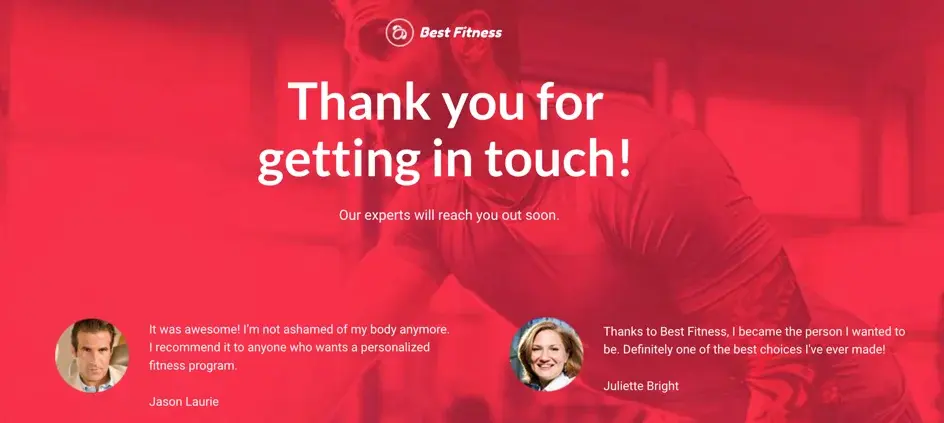 A thank you page confirms the form submission, and lets you provide other useful info to the user
First and foremost, a thank you page tells the user that the form has been successfully completed, so they can happily go about their day. But it also provides an excellent opportunity to give them more information such as product offers, helpful eBooks or blogs you’ve produced, the latest news for your company, your social accounts, customer testimonials, and anything else that might be useful.
4. Plenty of contact options
Younger people tend to prefer emailing and messaging, whereas older folks like to call. To cater for everyone, it’s best to provide as many contact options as possible (if you have a capacity to respond), being sure to prioritise them based on the needs of your particular users.
Contact options usually include:
- A contact form
- Email address
- Phone numbers
- A “chat with us” feature that connects to a staff member. You can also invite your users to your Facebook page if they prefer to talk to you on there. It’s also a good idea to include your hours of operation for these features.
5. Give them reasons to get in touch
What are the most common reasons your users get in touch, and how do they benefit from doing so? List these directly next to the contact form, to persuade the user to complete it. This small touch can increase the form’s conversion rate dramatically.
6. Show your staff on your contact us page
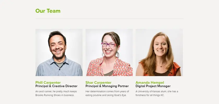 Showing staff profiles helps to build trust
If your contact page is focused around getting help from your staff members, it’s a good idea to show pictures of employees, and how they can assist. This creates a sense of friendliness and familiarity, and makes it seem like you’re happy to help them.
7. FAQs for a best practice contact us page
FAQs are a great way to reduce your staff’s support time. By pre-empting the questions of your users, you can reduce the need for a time-consuming conversation that may have already taken place with other customers.
Ask your team for the most common questions that come up with your customers, and add them to the contact page. Accordions (boxes that open and close when you click on them) are a good design pattern for FAQs, as they allow the user to read the shorter FAQ, and click on them for the longer answer. This keeps the page nice and clean.
If you have 20 or more FAQs, you may want to consider designing a separate page where you can group them into categories, and make them searchable with a search field.
8. Google map
If your prospects and clients regularly come to your office for meetings, adding a Google map to your contact page is extremely useful. They can click on the “directions” link and quickly find out how to get to your office.
If you’re including this, it’s also helpful to include information on where they can most easily park.
9. Social accounts
Your contact page is a great place to list your various social media pages, which the user can follow if they wish. The bigger your social audience, the greater your marketing power.
Best contact us page examples
Here’s some of the best contact us page examples you can find.
Oatly
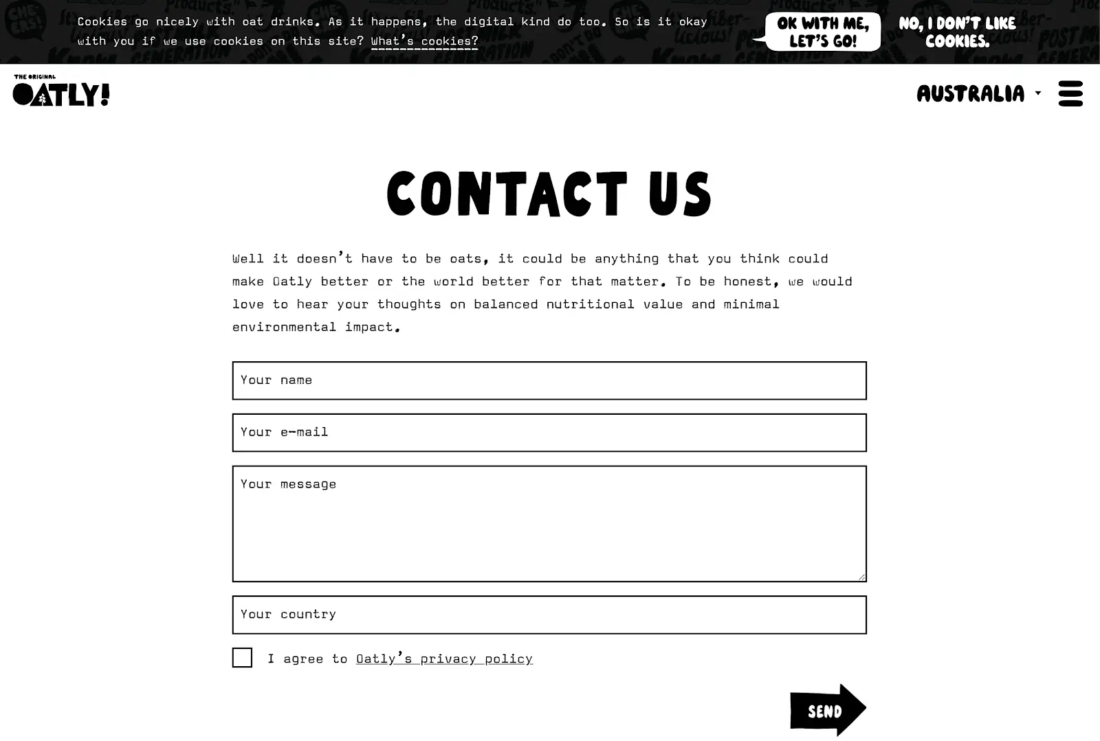
Oatly is a company that produces oat-based food products. Food is a relatively basic type of product to offer—there aren’t any complicated features to understand, or lengthy instructions on how to consume it. And their contact page is extremely simple to reflect this: just an invitation to provide feedback on their products, five fields, and a submit button. As far as best practices go for contact us pages, this one hits the mark.
Zendesk
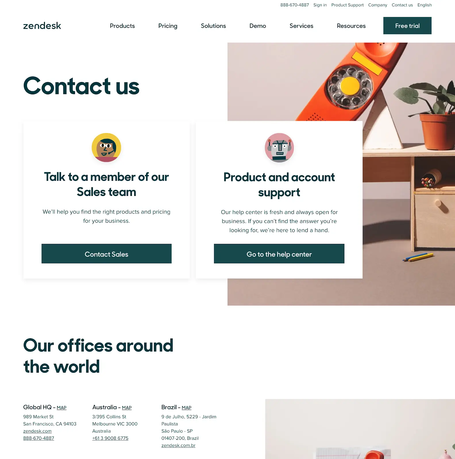
Zendesk have based the first section of this page on the two main goals of their user: contacting their sales team, or getting information about their software from their help centre. This is illustrated with two large sections that succinctly explain their purpose, and two clear call-to-action buttons for the user to navigate to their desired section.
Underneath, they offer contact information for each of their offices, in case the user wants to directly contact a team.
Westpac
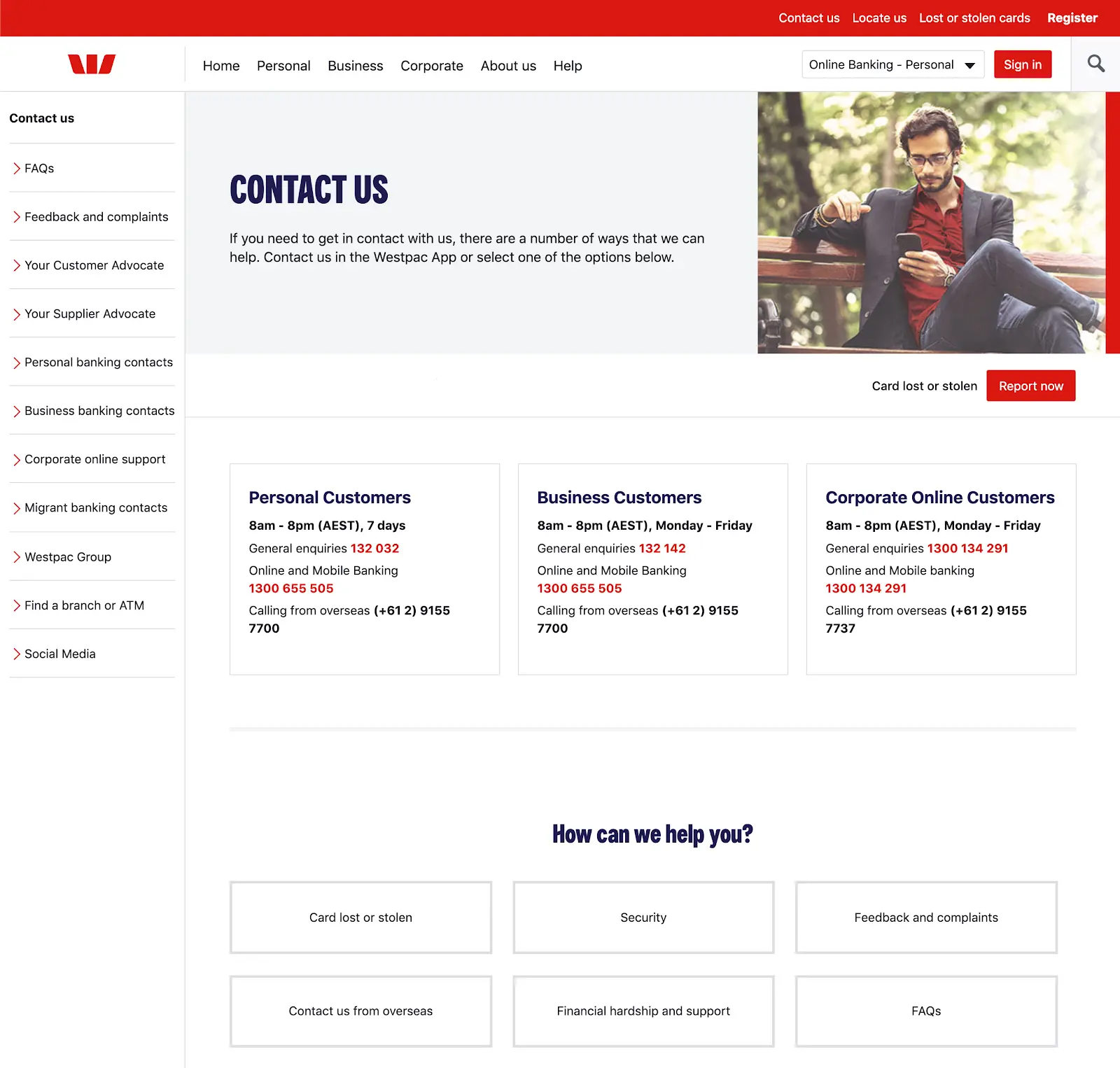
This is another excellent example of designing for the user, and one of the best contact us page examples we could find. As a large bank, Westpac presents contact information for each type of customer, including their opening times, and how to call from overseas. They then follow this up with the most common issues and options, presented as large clickable buttons.
If Westpac were to include a contact form on this page, they’d probably be inundated with enquiries about various issues, which would need to be sorted and redirected to the appropriate departments. They’ve avoided this by designing a contact page that invites the user to call them, or try to help themselves if they prefer.
Salesforce
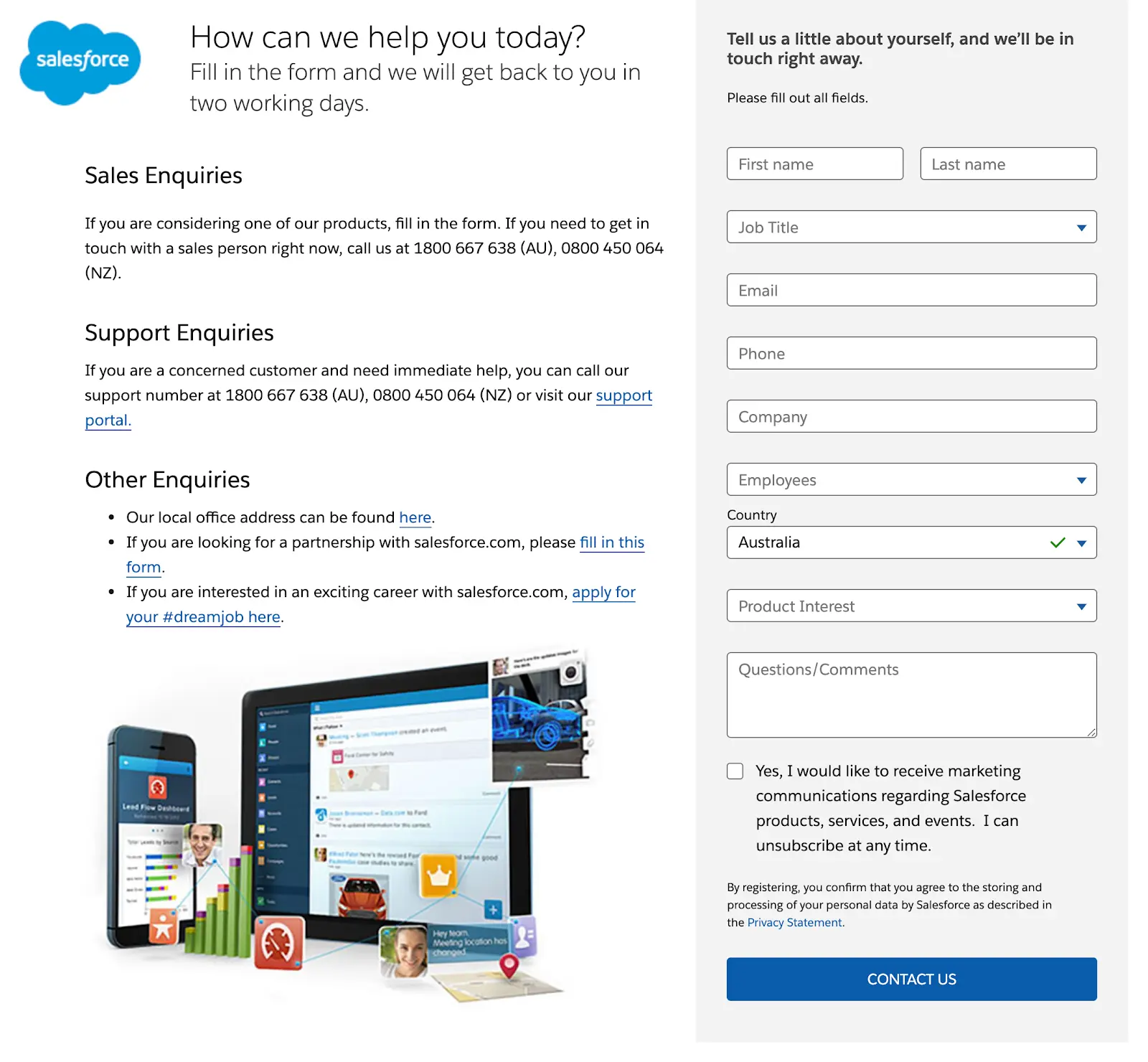
Salesforce is one of the world’s largest and most popular CRMs, but you might not think so from their contact page. Often, large companies (such as Westpac) guide you through a list of options on a contact page, which tells them what you want, and allows them to present the appropriate information. But Salesforce has opted for a traditional contact form as the focus of their page, with info on how to make sales, support, or other types of enquiries on the left-hand side.
The result is a clean, clear design. But as such a large company, it would be interesting to know how much extra customer support this creates for Salesforce.
The Walt Disney Company
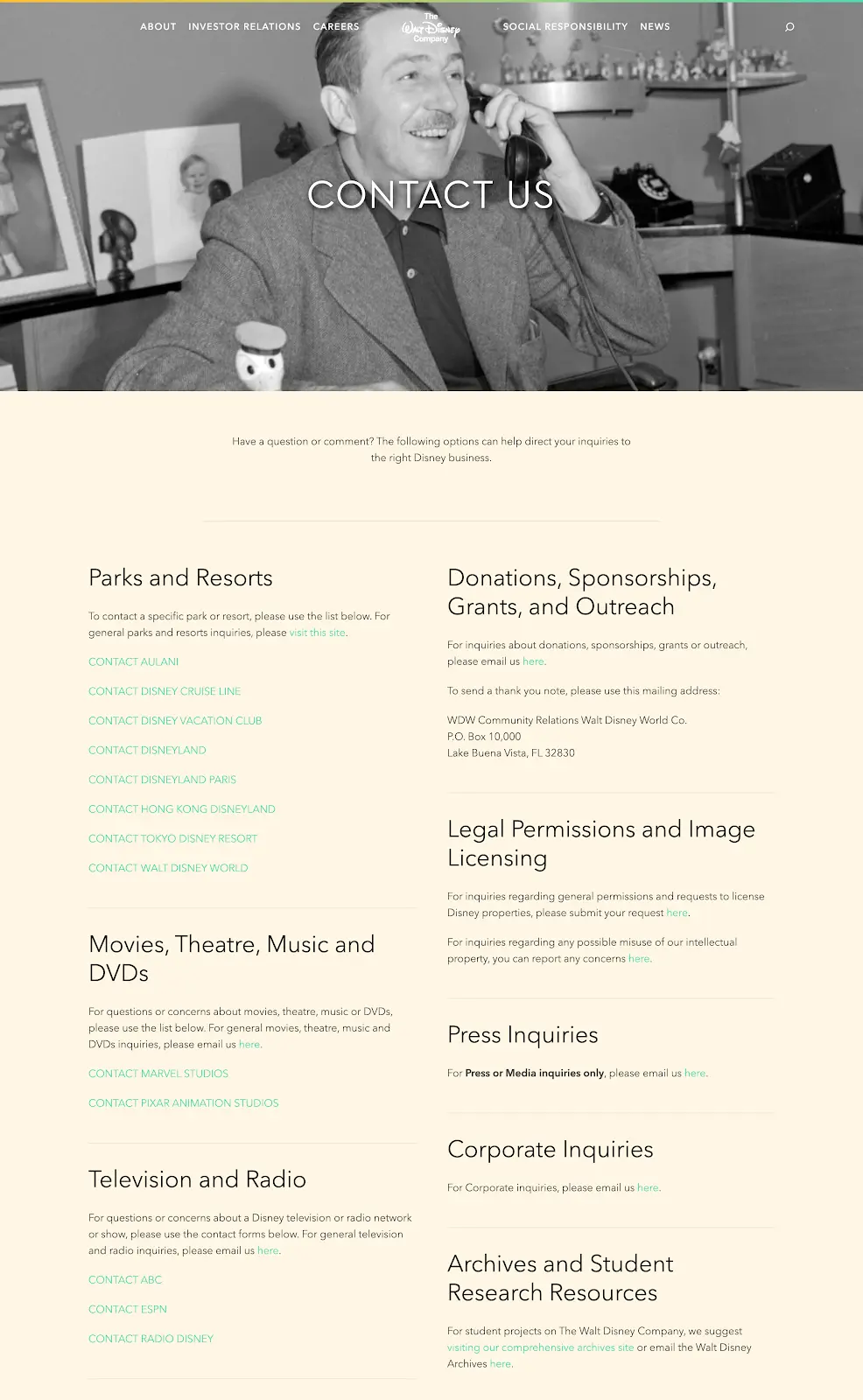
Being one of the largest and most diverse companies in the world, Walt Disney needs a contact page that allows the user to find the right department. Their page is simply a list of their departments, with information about the types of enquiries they accept, as well as addresses and phone numbers where appropriate.
A nice inclusion would be a search feature at the top of the page that allows the user to quickly find the department they’re looking for. It might also be sorted alphabetically, to help with scanning.
The page also includes a great picture of the man himself, answering a telephone call. This adds a sweet personal touch to the page, and almost makes Disney seem like a small, intimate company.
Shopify
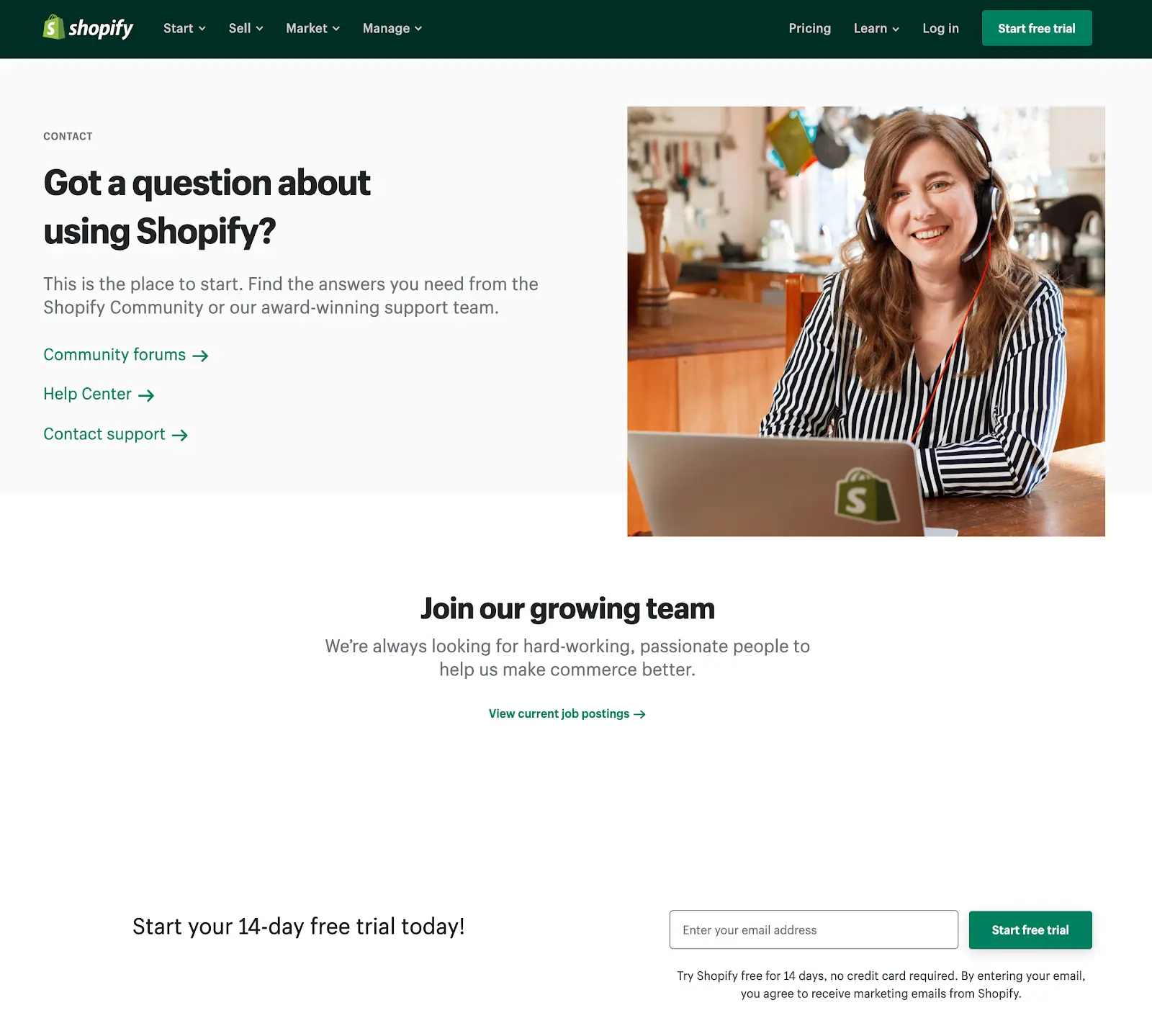
Like Salesforce, Shopify is also a large software company, who have opted for a more traditional approach to their contact page, that suits their size. The page focuses on three different ways to answer the customer’s potential question: their community forums, their help center, or contacting support directly. From these, the customer can access vast amounts of help, which makes it one of the best contact us page examples you’re likely to find.
They could improve the design a little by making these three options more prominent, perhaps turning them into large buttons instead of small links.
Truepic
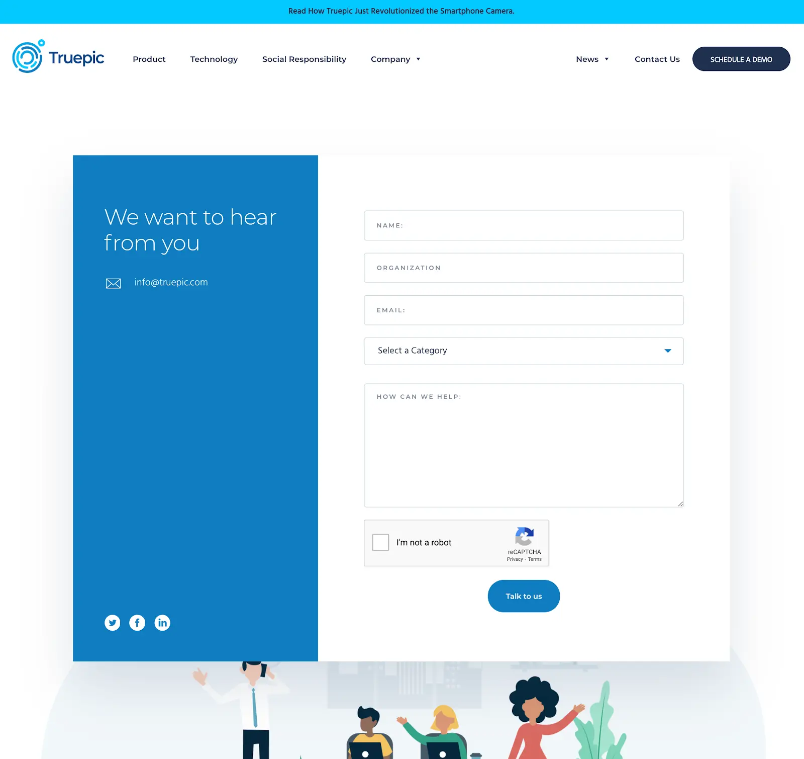
Another super-clean page that focuses on the contact form itself, with additional information on the left hand side. There’s no ambiguity on the page at all, and the form is easy and straightforward to complete.
They’ve also added their personality to the page through the cool illustrations along the bottom of the page, which breathes life into the design.
Business Casual Copywriting
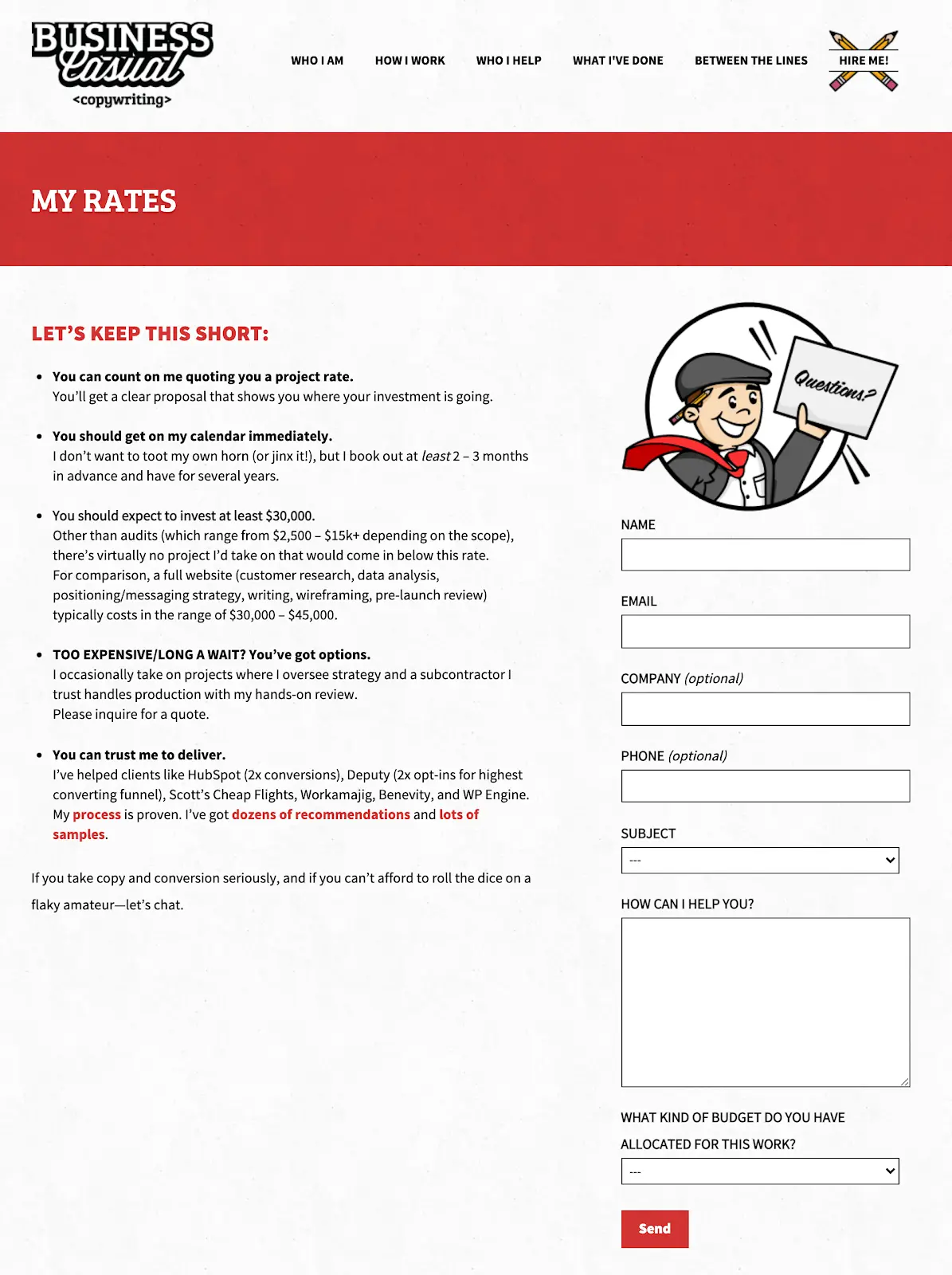
This is a superb example of copy that sells—as you might expect from the contact page for a copywriter! He devotes the left side of the page to selling himself, and telling the reader what he needs to know, and the right side of the page for the contact form itself.
The form is brief, clear, and excellently designed, using every best practice such as:
- Form labels outside the fields
- Optional fields clearly marked
- Select boxes blank by default (so you know it needs to be selected)
- A clear, highly-contrasting CTA button
There’s also a quirky illustration that stamps his branding onto the page. This is an excellent example of strong SEO copywriting.
Slack’s contact us page
Slack is a messaging app that has become a favourite for companies across the world. As a software company, they’ve made the wise choice to split their contact page into two: one for software support, and one for sales.
Slack Software Support
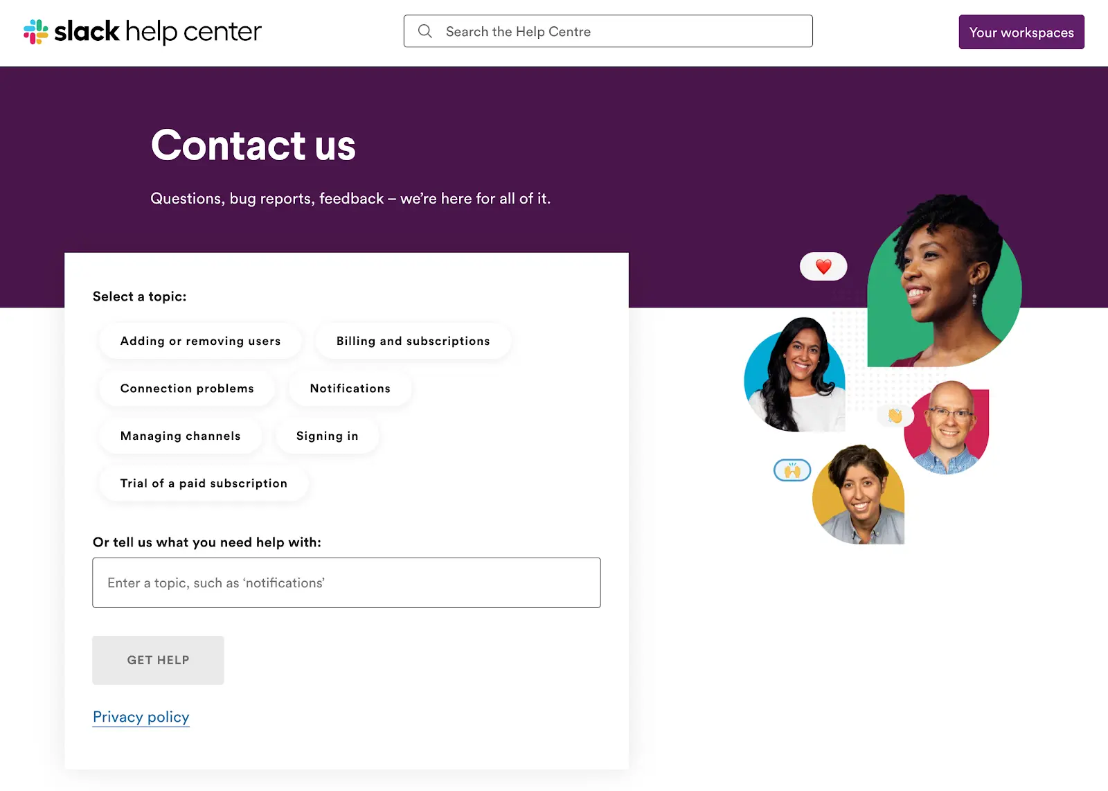
This contact page allows the user to search for their desired topic by clicking on one of the buttons, or performing a search. When they complete either of these, they’re presented with narrowed down search options, as well as the ability to create a support ticket.
This design is incredibly flexible, allowing the user to easily find the information they need, and get further help if necessary. We wouldn’t expect anything less than from a company such as Slack, who are renowned for their design skills.
Slack sales
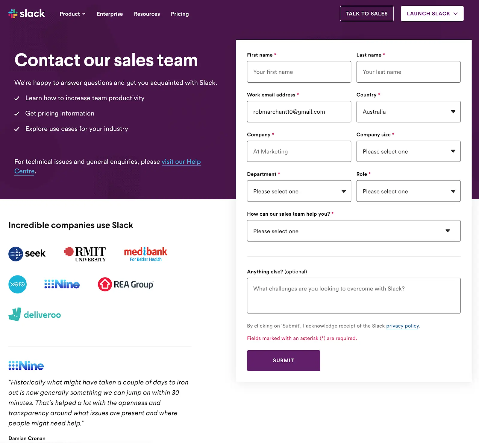
Slack’s “contact sales” page has a completely different purpose: to convince the prospect how great they are, and encourage them to complete the enquiry form. They do this by telling you what you’re going to get from contacting them, displaying some of the large companies who use them, and also throwing in a testimonial from Nine News.
The form itself is a bit bigger than you might expect on a contact page, and also sits across two columns (which makes it slightly harder for people to complete). But the language used for the labels is clear, and the user shouldn’t have any problems.
That’s it! We hope you enjoyed our guide to creating a best practice contact us page for your business.