10 Killer UX Tips And Tricks To Improve Your Website
UX is a process used to improve a user’s experience of something. In terms of websites, this means clear and easy-to-find information, intuitive features, and above all else, a user being able to complete their goal quickly and efficiently. With the right UX tips and tricks, you can turn your website from a bewildering cacophony of colours and features into a clear and logical piece of art that people love to use.
That’s why we’ve created this list of 10 exceptional UX tips and tricks for your website, so that you enhance its design and see a potentially drastic improvement in your conversion rates.
Time and cost
Our list of recommendations is extensive, so this may take you anywhere from an hour to a month, depending on how deep you want to go. We suggest starting from the top of the list and working your day down.
As for cost, you’ll just need someone who can update your website’s content and features.
What you need
You’ll need a couple of things to complete these tips and tricks:
- Someone who can update the website’s content
- Someone who can update the website’s code
UX tips and tricks to improve your website
Here’s our 10 UX tips and tricks to improve your website:
1. Simplify your menu’s language
Your navigation menu is one of the most important features of your website. It allows people to find the information they’re looking for, so its language must be as clear, straightforward, and as obvious as possible.
Try working through the following list to improve the wording of your navigation:
- Is the wording for each menu item accurate? For example—are you using “insights” instead of “blog,” when “blog” is the best description of the page?
- Are you using the most common, recognisable, and succinct terms available? E.g. Avoid “what people say about us” in favour of “reviews,” which is much simpler.
- Cut out as many unnecessary words as you can, like the “your” in the “your account” link, or the “our” in “our blog.” The fewer words in your navigation, the easier it will be to digest and understand.
2. Make your call-to-actions unmissable
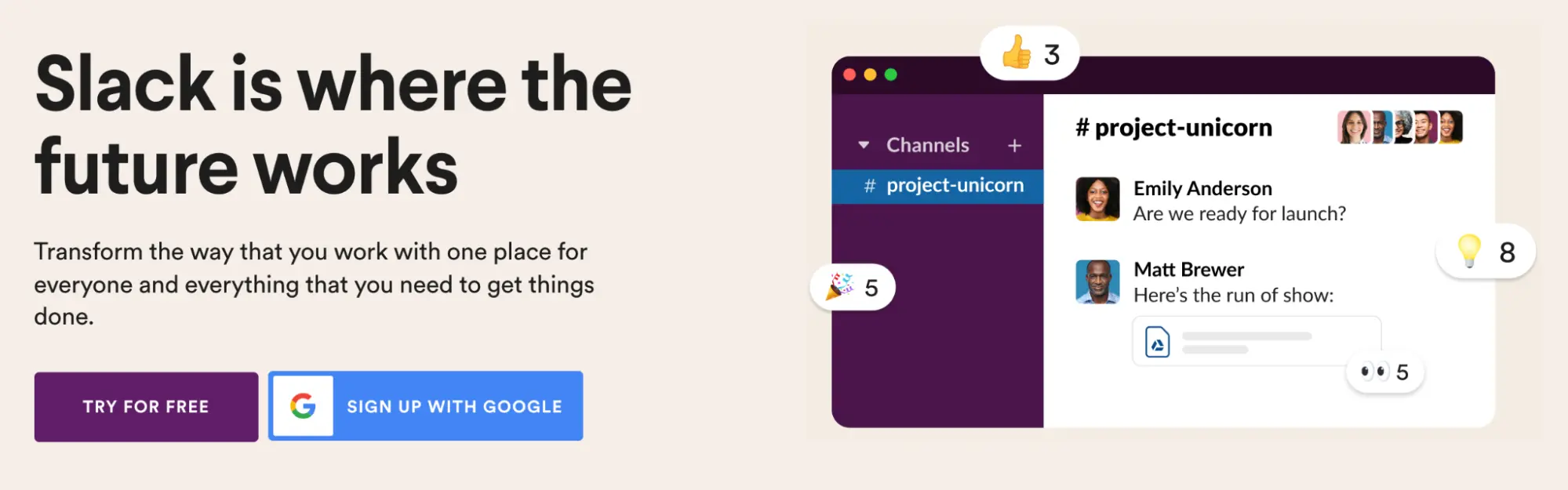 Slack’s two CTAs are nice and clear
Call to actions (CTAs) are the buttons you want people to click on, the forms you want them to complete, or any other crucial action you’re encouraging. So it goes without saying that these areas should be highly visible, using text sizes, colours, and imagery that make them eye-catching.
Here are some ways to improve your CTAs:
- Make sure that the button uses a colour that contrasts with the rest of the website. If you use swathes of black in your design and a black call-to-action, it won’t stand out. You need to pick a colour that is visually distinct from the rest of the website. Once done, try the “squint test” by squinting at the screen with your eyes barely open—if you can clearly make out the button, it stands out well!
- Increase the size of your button, so it’s easier to spot.
- Surround forms with plenty of negative space, or encapsulate them in a border.
- If appropriate, use a big header with your call to action, preferably one that conveys an enticing benefit for completing it.
3. Make your forms awesome (one of the best UX tips)
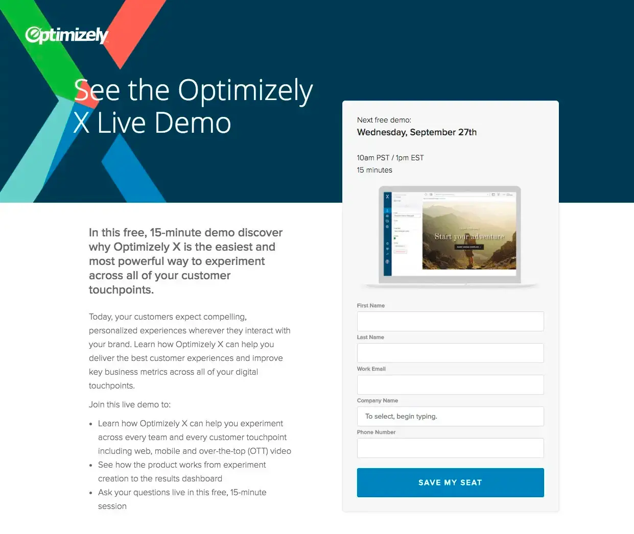 Your form is the most important element on the page, and must be impeccably designed
Forms are how people submit enquiries, request your services, buy your products, and contact you, so they must be clear and easy-to-use. Even small improvements to a form can make drastic improvements to its conversion rate. Here’s some of the most effective enhancements you can make:
- Be conventional. A form with stripy borders and other artistic embellishments may look pretty, but it will make it less usable, and you’ll pay for it with conversions. Convention may be boring, but it works! Keep your form nice and simple.
- Display your form in a single column, as these are easier to complete than multi-column forms (an exception is related fields such as “first name” and “last name,” which can sit side-by-side).
- Make the submit button highly contrasting or bright, so that it’s impossible to miss.
- Make the form labels as simple and clear as possible, removing any unnecessary words (a common example is using just “email” instead of “email address.”)
- Use permanent labels that sit outside the form field, so that they don’t disappear once the user starts typing.
- Make the form fields nice and large on mobile, so that the user can easily tap on them.
- Use a white background for the form fields, as gray backgrounds are associated with disabled fields.
- Place form errors next to their associated field, and remove them as soon as they’re resolved.
- Ensure that hitting the “tab” key moves to the next field.
4. Make links look like links
If a link is the same colour as the rest of your text, or a hue so close that it’s almost indistinguishable, how will people know to click on it? This is called “affordance” in UX—the idea that things that are clickable or interactive must look so. That’s why buttons became such a popular design pattern on the web. They’re a metaphor for real-world buttons, which everyone knows you can push.
Make sure your links are either in a colour that is noticeably different from your regular text colour, or is underlined to tell the user it can be clicked. Or if you really want to make it clear to users, do both.
5. Write great headings
It’s no secret that people don’t read much text on websites, but the one thing they do read are headings, especially those nearer the top of the page. They are the best opportunity to sell what you’re trying to sell, which is why it’s crucial to put on your advertising cap and write headings that convey the biggest benefit for what you’re selling. Don’t worry about being clever or funny—just state the benefit in simple, easy-to-understand terms that people can quickly read and understand.
Here are some good examples:
- We are the digital marketing partner you’ve always wanted.
- Protect buildings from tree roots.
- Store your belongings safely.
- Airtight roofing that protects your home.
Work through your site and update your headings to better sell the services/products of each page. If your headings are enticing enough, people are much more likely to read other areas of content.
If you’d like to learn more, check out our article on how to produce solid content.
6. Chunk information
 A good example of chunked information
Ever landed on a website and been faced with an imposing wall of text? If you’re like most of us, you probably jumped ship. We usually scan websites rather than reading them, cherry-picking the information we’re looking for, so that we can accomplish our goal more quickly.
To cater for this behaviour, chunk as much information on your website as possible. Use headings, one or two line paragraphs, and bullet points to communicate your info. The only time you should consider using larger blocks of text is in educational info, where the person is more likely to read it all.
7. Add breadcrumbs
Breadcrumbs are a navigational tool that allow people to see exactly where they are in your website. If your website has a deep structure, with 2+ levels of subpages that people can burrow into, including a breadcrumb above the page’s header will let them orientate themselves and understand where they are in your site. They can also quickly click back to the higher level pages if they want to.
8. Give feedback
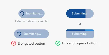
Some examples of good practices for loading buttons
In the world of UX, feedback is showing the user that something is happening after they completed an action. For example, if they add a product to their cart, and this function takes a few seconds to complete, you can replace the button’s “add to cart” text with a spinning icon to show that the product is adding. Similarly, if they click on a dropdown field with hundreds of dynamic options, and this data takes a little while to load, you can temporarily show text that says “loading options…”
If there’s an interactive element on your website that takes a while to respond after being used, always give immediate feedback to the user on what’s happening. Otherwise, they won’t know whether their action worked or not, and may leave your site in frustration.
9. Be mobile friendly
Google recently released its Core Web Vitals algorithm update, which prioritises a good user experience for mobile. So if your mobile site has some usability issues, you’ll pay for it with your Google ranking.
These are some of the most effective things you can do to improve the usability of your mobile site:
- Make tappable things like buttons and links big enough to easily tap. This is especially important if they are surrounded by other tappable things, which can result in an incorrect tap. Use size and plenty of white space to make every individual element easily tappable.
- Make your text size 16px at a minimum. This might seem large for mobiles, but is agreed to be the most accommodating size for most users.
- Place long blocks of text in accordions, which the user can tap to open/close if they want to read more. This helps to keep the smaller screen space clean and less overwhelming.
10. Do some usability testing
If you really want to get an idea of how usable your site is, you can complete something called “usability testing.” This is a time-tested method of asking people to complete tasks on your website, and observing their performance. You’ll be amazed at how people can mess up things that seem obvious to you, and this isn’t their fault—you just failed to anticipate how their mind works (an easy thing to do!) So the only way to really understand how your target audience thinks is by sitting down with them and watching how they handle your primary functions—adding products to cart, enquiring about your services, finding product pricing, etc.
This is a fundamental UX technique that requires some work to set up, but yields absolute gold.
UX tips and tricks—summary
We hope you enjoyed our 10 UX tips and tricks to improve your website. By following the advice laid out in this article, you can craft a highly usable website that your customers love to use, which will be reflected in the amount of business it generates.