What Is Information Design In Graphic Design? Examples + Guidelines
Everything that requires graphic design is made for a purpose. Adverts are created to generate sales, videos to inform, and websites to provide people with useful information. If you want people to understand the purpose of your design, and encourage them to take the desired actions, you need to create them using the principles of information design.
But what is information design, exactly? And why is it so important for graphic designers? Let’s find out.
What is information design in graphic design?
Information design is a way of presenting information so that it can be easily understood. It’s about knowing what information to include in a design, organising it in a logical way, and designing it so that the user can quickly perceive a hierarchy of importance, and what is related. The ultimate goal is to look at a design and instantly understand it, with the minimal amount of brainpower (called “cognitive effort” in usability circles).
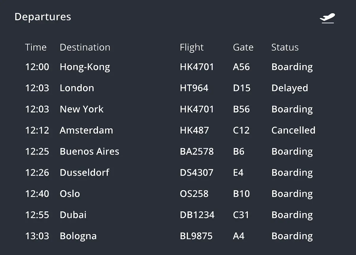
To illustrate the concept, take a look at this airport departures board:
This board uses many of the key principles of information design. The “Departures” title is in large text, at the top of the board, and has a bright yellow background, which instantly conveys the board’s purpose. Next to the title is a symbol of an airplane departing, cementing the purpose further.
For each flight, the most important information is either in bright yellow or bright white, which allows people to quickly identify their flight and the gate they need to go to. Less important information is in grey, with variations of orange and red to signify the flight’s unique state (delayed or cancelled). Each flight also has a distinct black background that separates it from others, telling people that they are unique services, and adhering to Gestalt principles (how people identify related information). Finally, the flight’s labels (time, destination, etc.) are in a lighter grey colour, distinguishing them from the flight information itself, which people intuitively understand as a result.
Now look at the same image without any information design. The text has been made the same colour, size, and boldness, and the background is a single colour.
The information is clear, but it’s much harder to understand. Without the various text sizes, colours, and dividing background colours, nothing is given priority or shown to be related. If somebody was rushing to their flight, they may not even notice the board, let alone understand it quickly enough to reach the plane on time. That’s the power of information design: it quickly tells people what they are looking at and what they need to get from it.
For a graphic designer who spends most of their time creating content that needs to be understood, whether that’s an email campaign, business report, or some other asset, the principles of information design will help you to do so. Some designers do this intuitively without being aware of the rules, but knowing what they are can help you to create more effective designs that achieve their desired goals. They encourage you to adopt a “form over style” approach where people immediately understand what they are looking at, which fosters trust and builds positive associations with the organisation that created it. Ultimately, information design is a form of wayfinding that helps people to find the right information, achieved with immaculate simplicity and beautiful in its own right.
3 key principles of information design in graphic design
1. Provide the right information
Simplicity is a foundation of information design, so you need to select and include the most crucial content for getting your message across. Nothing more, and nothing less. Every additional new piece of information increases the user’s cognitive load, making it harder and slower to understand, so make sure that it needs to be there.
If you’re unsure what information to include on your design, often, the people who are going to be using/consuming it can tell you. They’re the target audience, after all. This is a tenet of user-centred design (and CRO marketing by association), and when combined with the principles of information design, becomes a powerful way to create high-converting marketing assets.
2. Create hierarchy
Demonstrate the hierarchy of information clearly to the user, so they know what to read first, and in what order. This can be achieved in a number of ways:
- Placement—content that is at the top of the design will be read first, so should be the most important. This might encapsulate the purpose of the design, be a promotional headline, or something else.
- Size—the bigger the text, the more important it is. It also helps you to communicate content levels, such as titles, primary headers, secondary headers, etc. You can see this simple structure in a basic Word document, which has been designed this way because it allows people to intuitively grasp the document’s hierarchy.
- Boldness—this is a similar principle to size, but is more subtle. Emboldening important text will draw people’s eye to it, and shows that it’s significant.
- Colour—colour can be used cleverly to group related pieces of information, or make it stand out. The higher the contrast of the foreground and background colour, the more important it will seem. For example, a grey button on a black background won’t seem particularly important, but a bright yellow button will.
- Animation—things that move attract our attention. This can be exploited by designers to communicate priority, but only in small amounts. As with the other techniques in this list, use them excessively and nothing has priority.
3. Design for your audience
We already touched on this briefly above, but knowing your audience is a crucial part of good information design, because it tells you what to include. You could create the most beautiful, perfectly-designed thing imaginable, but if it contains the wrong information for your target audience, it’s tragically wasted.
To design for your target audience, examine your buyer personas, customer journeys, and other customer-related marketing assets that tell you who you’re selling to.
Information design in graphic design—examples
Here are three more examples of information design in graphic design, with brief explanations for each.
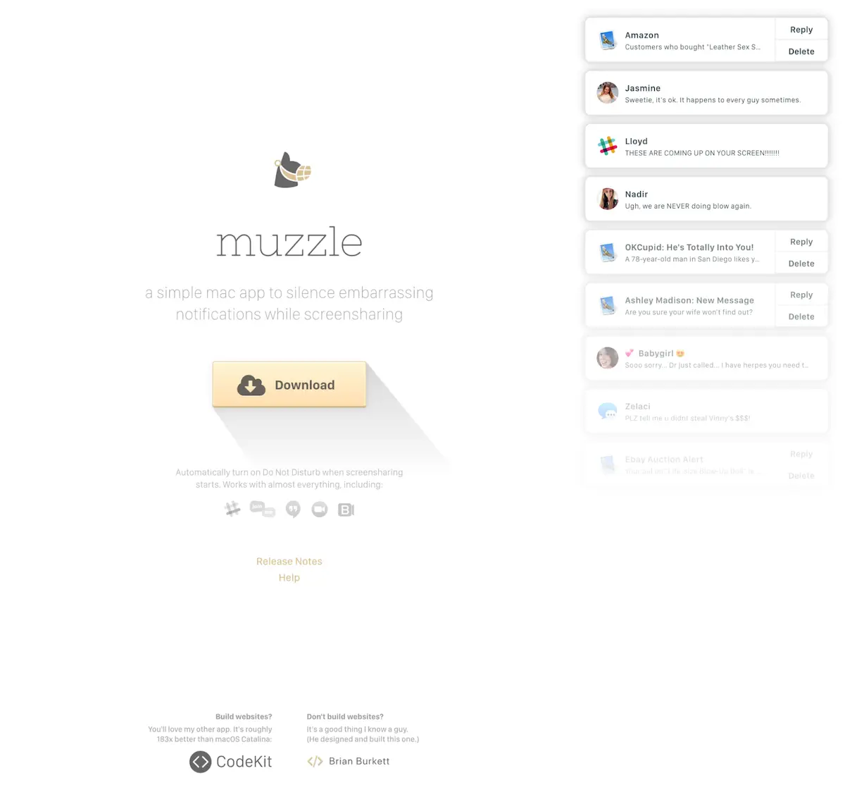
Muzzle landing page
Website pages are a good example of the necessity of information design. They usually have to pack lots of information into a small space (especially when viewed on mobiles), which means the information needs to be clearly prioritised, and displayed in ways that are consumable and quickly understandable. If this isn’t achieved, the person can exit and find another website from the billions online.
In this excellent example from Muzzle, the designer uses information design in the following ways:
- The name of the app is front, centre, and large, making it the focus of the page.
- Directly underneath is a concise description of what the app does.
- After that is a download button with a cool shading effect that draws the eye. The button also has a yellow background, which makes it stand out even more and gives it priority—just what you want from a CTA.
- Further explanation is provided underneath the button, but because this is less important, it’s smaller. The user will intuitively understand this priority.
- Extra useful information follows, which is smaller still.
- On the right-hand side of the page are embarrassing notifications that really drive home the value of the software.
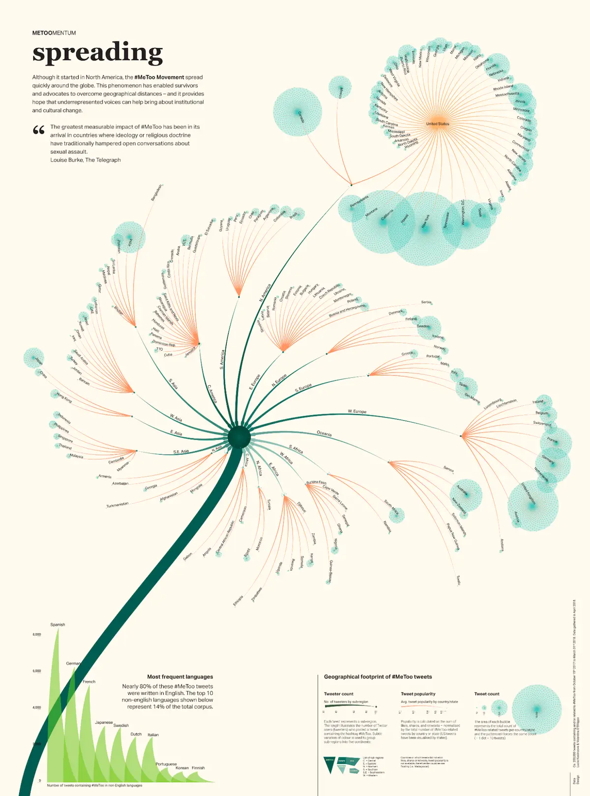
#MeToo infographic
This gorgeous infographic is about the spread of the #MeToo movement, and has been designed with immense skill. The purpose of the data is explained and highlighted on the top left, using a large header and smaller explanatory text. This is followed by an inspirational quote, before the focus of the infographic takes over: a large flower-like representation of which countries the #MeToo movement has taken hold, based on the frequency of tweets from each.
Imagine how much duller this information would be in a regular table? The designer has used a combination of text sizes, colours, and graphical metaphors to produce an exquisite example of information design.
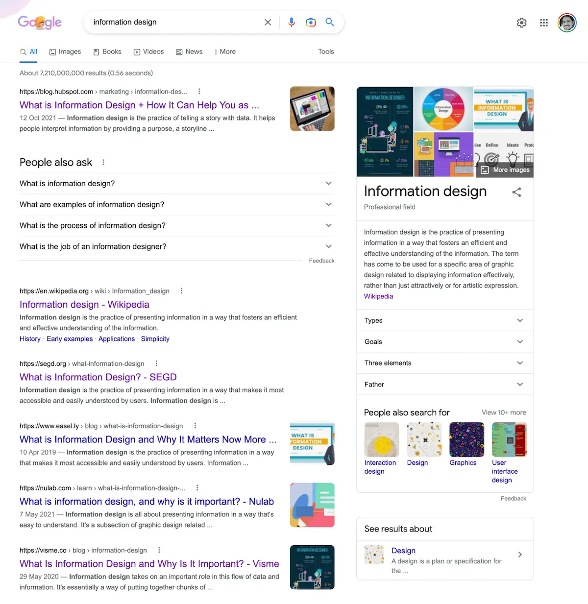
Google’s search results
For a stellar example of information design, you can look to a service you probably use every day: Google’s search engine.
Their search results may be simple and effortlessly usable, but designing them was no mean feat. Their task was nothing less than showing people huge quantities of information in a way that can be quickly consumed and navigated, to easily find what they are looking for.
Every type of information is displayed in a usable way. Webpages are displayed as a list, with the page’s name as the largest/prioritised text, and its URL and description in smaller text above and below. Each page is clearly defined and grouped using just the right amount of white space. “People also ask” results are shown as collapsible accordions to prevent clutter, and given importance by being placed near the top of the page, and with slightly larger text. Rich snippets like Wikipedia pages are shown on the right, defined and grouped using a simple grey border, and given a large heading to denote importance. Other rich snippets that Google might show include recipes, events, videos, products, or something else depending on what the user searched for, and every one of them uses the right blend of font sizes, colours, and layouts to communicate their priority and purpose.
Google’s search engine results page design has helped them to become the biggest search engine on the planet, and it has been achieved with sound information design principles.


