
Easy Guide To Web Lingo | A to Z Glossary
Web design and development is a complex business, and you can be forgiven for not knowing the difference between a CMS and CSS, a 301 and a 404, or the purpose of a supersonic software bot. In this article, we explain the most common web lingo and internet terminology in the industry, so that you can polish your web vocabulary and communicate more smoothly with designers and developers.
Web lingo & web design terminology—the full list
Here’s our full directory of web lingo & design terminology, covering the most common terms in the industry.
Browse by letter
A | B | C | D | E | F | G | H | I | J | L | M | N | O | P | R | S | T | U | W
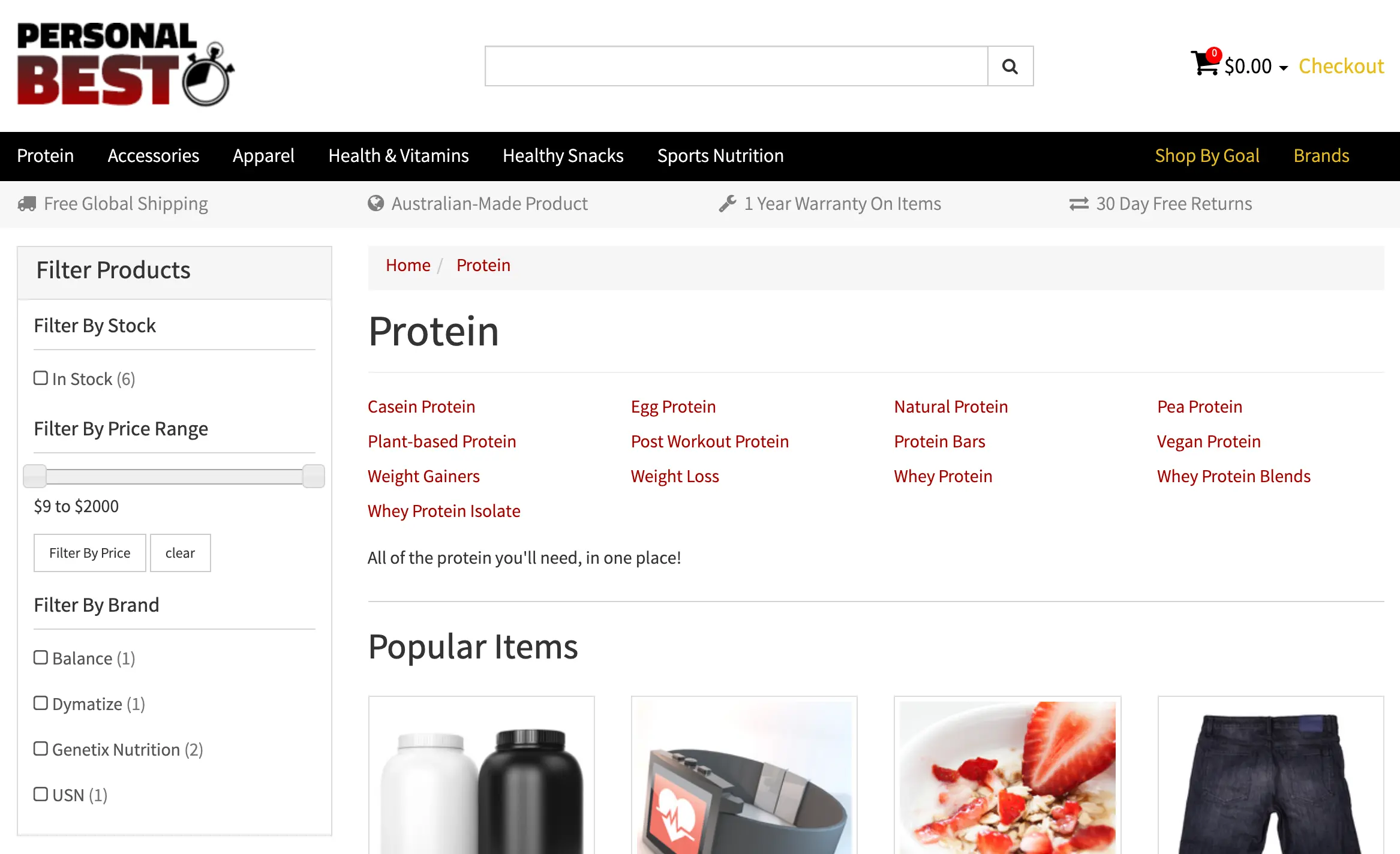
Alt text
Alt text is used to describe an image on a web page. It’s used for a number of reasons:
- To tell Google what the image is, and allow them to better understand the purpose of the page it’s on. This improves the page’s SEO.
- To describe the image to blind people who are browsing the page using a screen reader, so that they can understand what they’re looking at.
- To describe the image when it has failed to load for a user.
Accessibility
 Accessibility allows people with disabilities to use websites
Web accessibility is the practice of making websites usable by people with disabilities. This can include a wide range of disabilities, including:
- Visual issues such as poor eyesight, blindness, or colour blindness
- Restricted motor function that makes browsing a website harder
- Cognitive impairment that may make a website harder to understand
- Poor hearing or deafness
Under the Australian Disability Discrimination Act of 1992, every website must be usable for people with disabilities. Everyday life is harder for many people with disabilities, so web designers have a moral obligation to create websites that cater to them, and are as easy to use as possible.
Good accessibility design practices can be achieved by following the Web Content Accessibility Guidelines (WCAG), which every web designer should be familiar with.
Above the fold
Above the fold means everything that you can see on a web page without scrolling. The term is less common today because there are so many different ways to browse—content that is above the fold on a laptop won’t be the same on a mobile phone, because the screen sizes are completely different.
It’s good practice to put your most important content near the top of the page, regardless of which device it’s being viewed on. But “above the fold” is essentially meaningless in the world of responsive web design, where the website’s layout changes to suit the device being used.
A/B testing
A/B testing (also known as split testing) is a way to test two variations of something, to see which performs better. Here are some common examples:
- Test two email subject lines to see which gets more opens
- Test two different labels for a call to action button, to see which gets more clicks
- Test two different headlines on your home page, to see which results in more leads or sales (check out our guide on the best lead generation strategies to find out more).
During an A/B test, each variation should be sent or seen by the same number of people (or as close as possible). The results are then measured to see which of the variations has the most success, which is then incorporated as the standard. A/B testing can be an excellent way to make small incremental improvements to your web design, email marketing, social marketing, SEO, and pretty much anything related to digital marketing.
Analytics
In the world of the web, analytics usually refers to statistics that are relevant for a web page, which allow you to measure its performance and better understand how your users’ behave. The most popular analytics software is Google Analytics, and it offers useful metrics such as page views, average time on page, bounce rate, devices used, and the user’s source.
Regularly measuring your most important web and digital marketing metrics, you can make informed decisions on how to improve your business.
Anchor text
A link has two main components: its anchor text, and destination URL. The anchor text is the text that shows on the web page for the link, and should ideally describe where the user is being taken when they click on it. The destination URL is the page that is accessed when the link is clicked.
Bot
A bot is a piece of software that performs a repetitive task on the internet. One of the most common examples are the bots that Google uses to crawl web pages, to identify the content on the page (including updated content). This task wouldn’t be possible without the use of bots, which complete the task at lightning speeds, and allow Google to index websites quickly and efficiently.
Because bots are created by humans, they can be good or bad. Examples of bad bots are those that automatically fill out web forms with advertisements (spam), which then gets emailed to the website’s owner.
Blog
Blog stands for “web log,” and was originally used to share a person’s thoughts on a website. Since then, a blog has become a page to share valuable information on a particular topic, which people can find in search engines.
For a business, blogs are a fantastic way to offer your prospects and customers educational information upfront, without asking for anything in return. And when you keep on providing this value to people for free, they’ll start to see you as a credible source of information, share your blogs more often, and over time, increase your SEO.
Breadcrumb
Remember the story of Hansel & Gretel, who left a trail of breadcrumbs in the forest to find their way home again? Website breadcrumbs work in a similar way—they show your location on the website by displaying the pages and sub-pages, each one a “breadcrumb” that you can follow back home again.
Breadcrumbs work well for large and complicated sites with many levels of sub-pages. eBay is a great example because of its immense size and complexity:
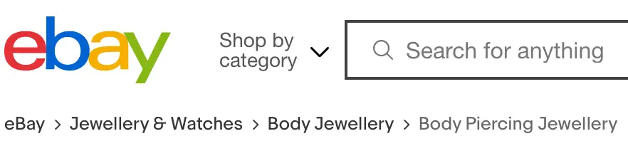 Breadcrumbs on eBay
Breakpoints
In responsive web design, breakpoints refer to the points when a webpage’s layout changes to better suit the device. Usually, breakpoints are declared for every common type of device, such as mobile, tablet, laptop, and desktop. When the browser width falls within two breakpoints, the design should change to suit that particular width.
These are some examples of common breakpoint widths for devices:
- Mobiles: 320px to 480px
- Tablets: 481px to 768px:
- Laptops: 769px to 1024px
- Desktops: 1025px to 1200px
- Extra large screens: 1201px or more
Browser
Is what you are viewing this article on right now! Primarily used to access the internet, the most common browsers are Chrome, Firefox, Safari, and Microsoft Edge.2
Designers love to hate browsers, because every browser displays web pages in slightly different ways, which can cause things to break on some browsers but no others. This creates extra work for them to make the experience uniform.
Cache
To make websites load more quickly for users, browsers save previously-visited “cached” copies on the user’s computers. This allows them to load many of the saved elements, which drastically quickens loading time. But this can cause problems for website designs (or updates), because you want to see the very latest version rather than the cached version. So when a developer asked you to “clear your browser cache,” this is the reason why.
CMS
CMS stands for content management system—a web application designed to easily manage your website’s content and features without the need for coding experience. WordPress is the world’s most popular CMS, and powers a mammoth 34% of all websites on the internet.3 And for good reason—it’s a highly usable platform that users and developers love.
Cookie
A web cookie (or HTTP cookie) is a data file that is created when a user is browsing a website, which gets placed on their computer. The file is used to store useful information such as whether the person has logged into their website account, items they stored in their shopping cart, or whether they already saw a pop-up on the site. In theory, they allow the website’s developer to create a better experience for the user, but can also be used for nefarious purposes.
Because cookies can store information on a user, they’ve also recently become a privacy concern, with many websites requesting the user’s permission to create them. This information should also be outlined in your marketing privacy policy.
Crawl
In the context of web pages, a “crawl” is when a search engine’s bot “reads” the page’s content, to either add the page to its index, or update it. Search engines need to regularly crawl web pages to keep their information up to date, which allows them to provide the most relevant and useful information in its search results.
CSS
CSS (Cascading Style Sheet) is what allows you create good-looking websites by editing its style. This includes positioning and aligning its elements, editing their sizes, giving them colour, shadows, adding animation, and a whole lot more. Without CSS, every web page would look like a boring Word document. Hooray for CSS!
The styles outlined in your CSS should also reflect your brand style guide.
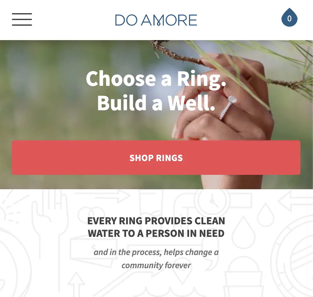
Call to action (CTA)
A call to action is a button that the website’s owner wants you to click, because it completes a desirable action for them. Common actions for CTA buttons are completing an order, submitting an enquiry, or subscribing to a newsletter.
The CTA is often the most important button on the page, so is usually big, bright, and bold to draw the attention of the user. It uses colour that contrasts highly with the rest of the design, and if you squint your eyes while looking at the page, you should still be able to make it out.
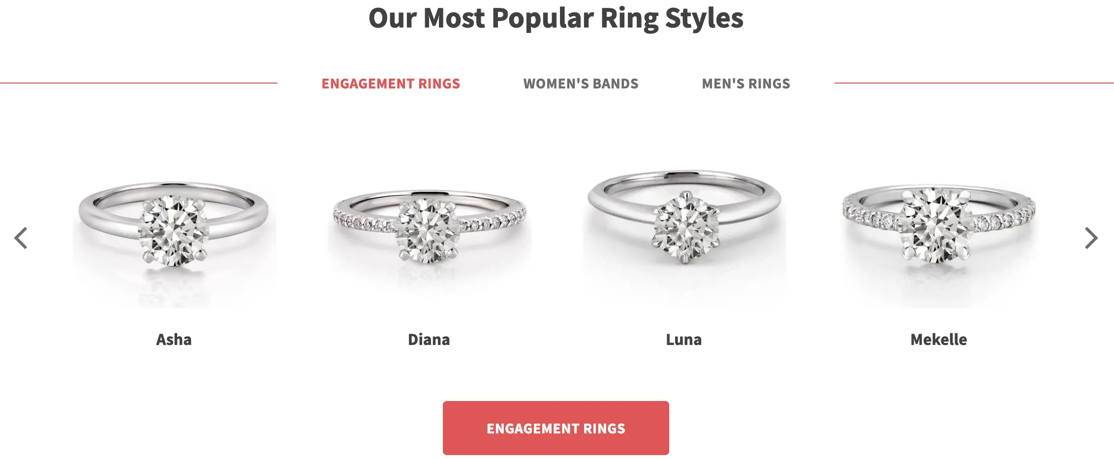 A call to action button on an engagement ring website. Image from Do Amore
CAPTCHA
True to its name, a “captcha” catches all the baddies using your website form, and prevents their spam from reaching you. It is a feature created by Google that has proven to be an effective method to stop spam bots sending you “fake” enquiries.
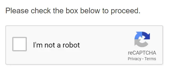 Google’s latest Captcha feature
Design phase
In the context of a new website design, the design phase refers to the stage of the project where the visual aspects of the website are created. This includes:
- Wireframes—a web page wireframe is (usually) a black and white “frame” of the page which shows how it will be laid out. Each section of the page is clearly outlined (i.e. the header, banner area, products, footer) so that the website’s owner can review the layout of the page.
- Design mockups—this is how your final design will look when it’s converted into a website. It includes the colour, typography, graphics, and content of the design, created in a graphic tool such as Photoshop, Illustrator, or Canva. Your designer will use your branding’s unique graphic design style in the design.
When the design phase is done and the website’s owner is happy with how everything looks, the development phase usually follows, which is where the website will be coded with HTML, CSS, JavaScript, and a server-side web development language.
Development phase
In the context of a new website design, the development phase refers to the stage of the project where the design is coded, so that it functions as a website. The developer who completes this phases uses web languages such as HTML, CSS, and JavaScript to create the “front-end” features for the site, and usually a server-side language like PHP, C#, Python, or Ruby which gives the website access to databases and stored files.
Domain and subdomain
A domain is the address of your website on the Internet (e.g. google.com.au). Domains are essential for any website, and come in a huge range of extensions specific to your country. Australian extensions include: .com and .com.au.
A website can also have a subdomain to distinguish it from the primary domain. This is essentially a domain that starts with a different word, and a common example is for website blogs such as HubSpot’s:
- Main domain: hubspot.com.au
- Subdomain: blog.hubspot.com.au
Domain authority (DA)
Domain authority is a 0-100 score that describes the strength of a website’s search engine ranking. It was created by SEO firm Moz as a way to predict how likely a website will rank in search engine results, and is primarily based on the number of inbound links to a website.
Google or other search engines haven’t had anything to do with its creation, and your domain authority is not an official Google ranking factor. It’s simply a useful way to predict how well your website might perform against competitors.
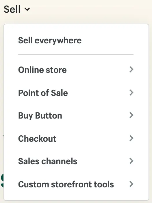
Dropdown menu
A dropdown menu is a link or button that “drops down” with more options when hovered over or clicked. They are commonly used in navigation menus, as a way to browse related pages. You can see an example below of a dropdown menu—the user clicks on “Sell” to reveal the options related to the term.
Duplicate content
Duplicate content refers to a webpage that has the same or very similar content as another page on the site. When this happens, it’s hard for Google to know which one of them is the “main” page, so they’ll pick just one of them to display in their results for a relevant keyword search, and hide the other. This may turn out to be the page that you don’t want Google to show, so it’s important to remove any duplicate content from your site, or add canonical tags that tells Google which is the “main” content out of the two.
E-commerce site
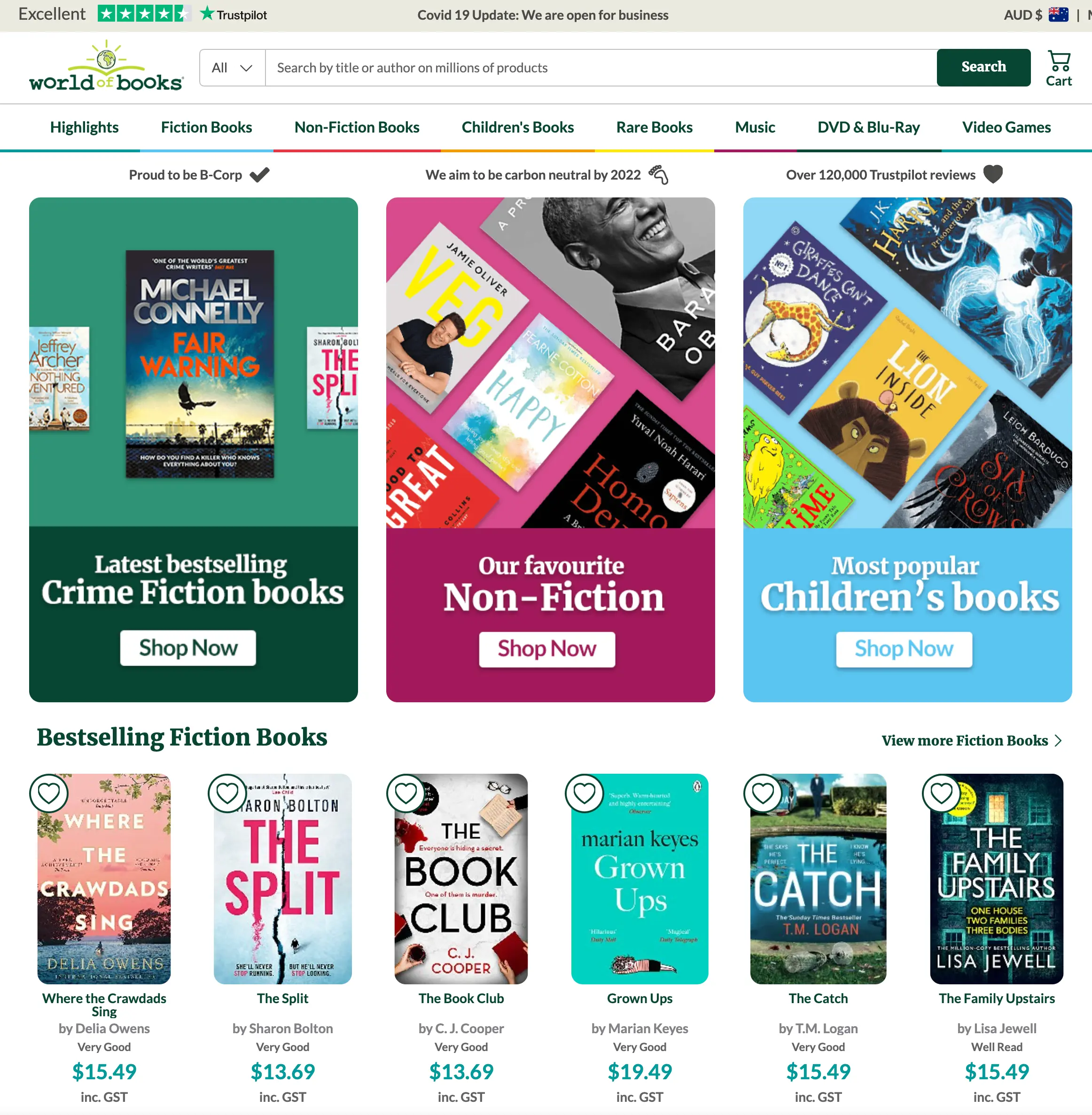 An e-commerce site that sells second-hand books, World of Books
An e-commerce site is one that sells products online. Some of the most popular e-commerce sites are eBay and Amazon, which sell an astonishing number of products every year. The majority of ecommerce websites on the internet are retail stores selling products directly to the public.
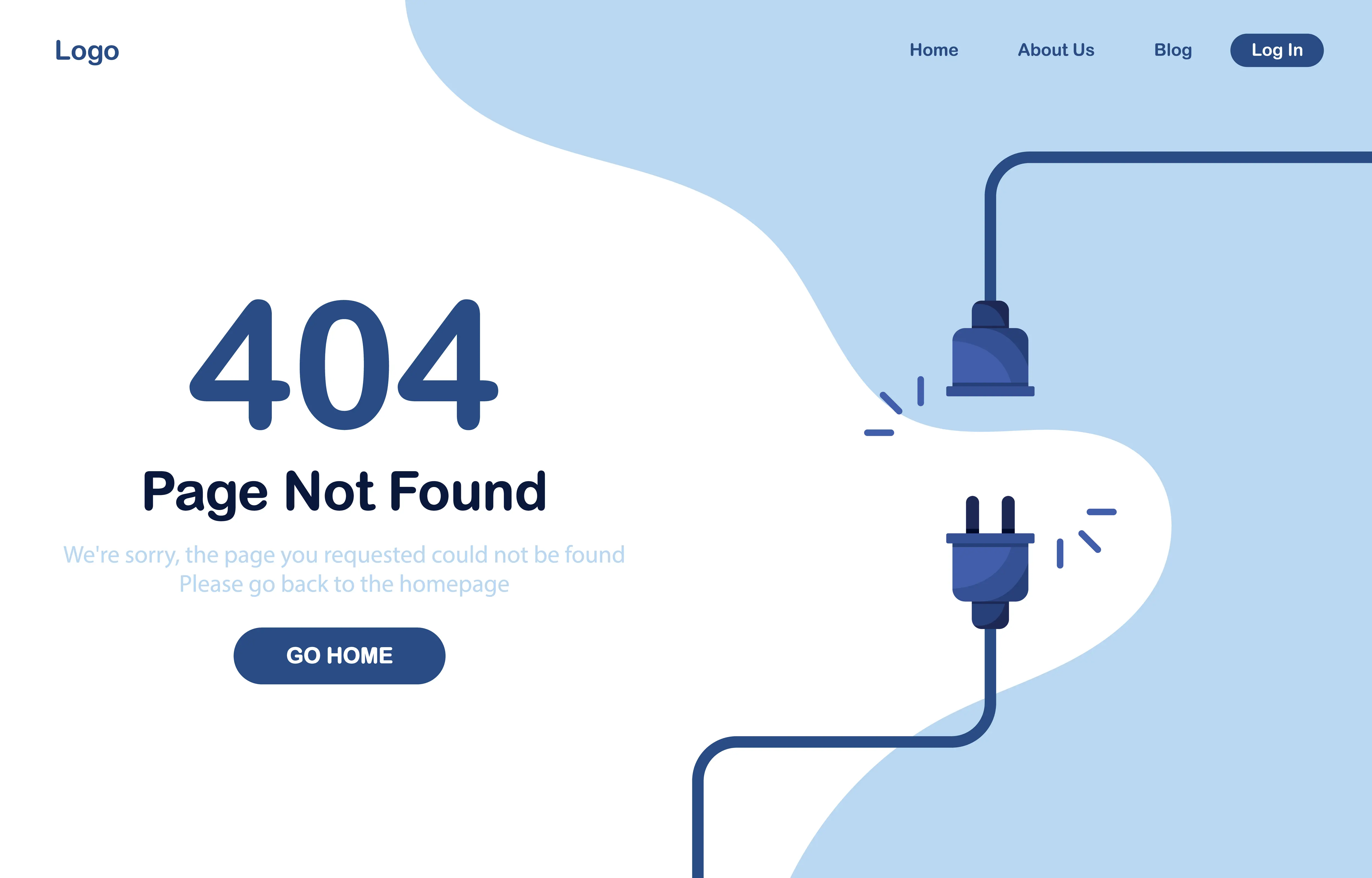
404 error
Ever stumbled across this before? A ‘404 Error’ happens when the page can’t be found for the URL. This might be because the link is wrong, or the page has been recently removed.
404 error pages can be designed in a super creative way, and turn an error into something fun, as with the example below.
Extension
When dealing with files, an extension refers to the file’s type. For example, the extension .JPG is an image file, and .DOCX is a word document. In web design and development there are many different file extensions we use every day, which some of the most common being .GIF, .JPG, .PNG, .PDF, .PSD, .DOCX, .CSS, .HTML, .PHP, and .JS.
Favicon
A favicon is the cool little graphic that appears in the browser tab for a website, as well as the bookmark icon. It’s short for “favourite icon,” and allows you to quickly identify your website among the obscene number of tabs you probably have open.
 Examples of 3 favicons in Google Chrome
Footer
The footer is the section at the very bottom of your website, and contains less important information such as:
- Secondary navigation menu
- ABN numbers
- Copyright declaration
- License numbers
- Accreditations
- Terms & conditions
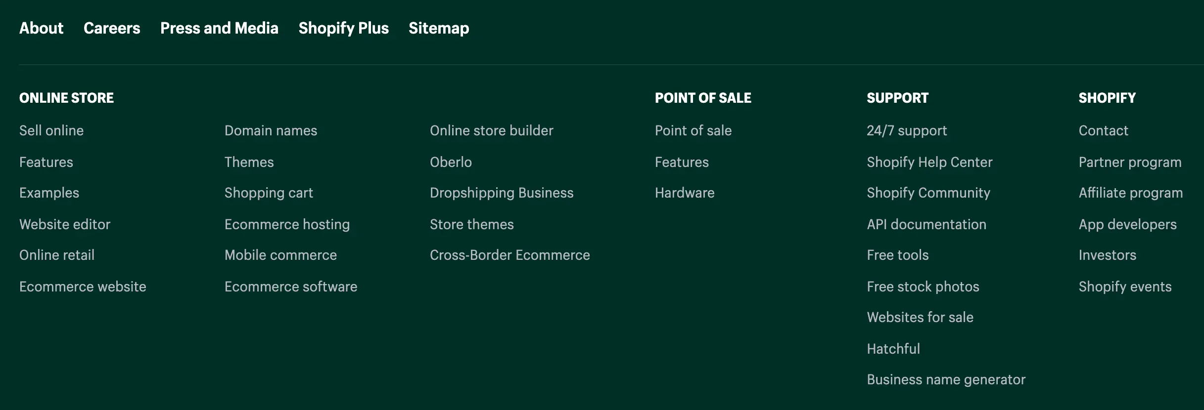 A website footer
FTP (File Transfer Protocol)
FTP is a method for transferring digital information from one computer to another. In the case of web development, the developer will usually code the website on their computer, and then use FTP to transfer their code onto the website’s server (the computer where the website is stored). If the website is live, this method also means that the developer can work “locally” on their computer without breaking the live website.
GIF
Another popular image format for the web, GIFs are commonly used for images that have a very limited and solid colour pallet, or are animated. Because of the small file type – depending on the image, your designer may opt to use a GIF over a JPG.
Hamburger menu
A hamburger menu is a clickable icon that opens (and closes) a website menu. It’s often used for a website’s mobile design as a way to save space by hiding the navigation menu, as seen in the example below.
 Hamburger menu on the top left. Image from Do Amore
Header
 Woolworths’ website header
The header is the section at the very top of your website, and contains key elements such as:
- Logo
- Company slogan
- Primary navigation menu
- Contact numbers
- Shopping cart (e-commerce site)
Hero image
 Hero image for a website, which uses it as an advertisement
A website’s hero image is the large image that appears at the top of the page, usually full-width, and directly underneath the navigation bar. It can be used for a number of different reasons, including:
- To illustrate the website’s (or webpage’s) purpose.
- To draw attention to a call to action button.
- To reinforce the company’s branding.
- To increase the website’s beauty.
When good imagery is used for a hero image, it can create an excellent first impression on the user.
Hover state
A hover state is how a link or button looks when you hover over it. The main reason for a hover state is to let the user know that the link or button does something—it’s a polite way of saying “you can click me!” In the world of User Experience (UX), this is called “affordance.” Hover states also help to breathe life into the website’s design, giving it a personality that makes it more satisfying and engaging to use.
Hover states often use colour changes to let the user know they are clickable, but it’s also common to add underlines to links, slightly enlarge the element, or swap out icons.
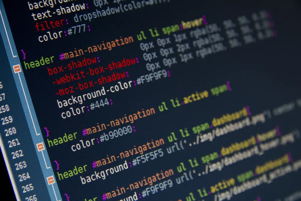
HTML
HTML (HyperText Markup Language) is the one of the main languages for creating web pages. It allows you to create the basic structure and outline of the page, where its content can be inserted and then styled with CSS.
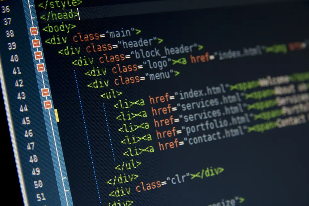 HTML code
Information architecture
A website’s information architecture is a fancy way of saying how its pages are organised. Some websites can be very complex, so creating a relevant and logical page structure will allow the user to find the pages they are looking for without too much effort. It’s also critical for Google to understand the purpose of your website, and whether to show pages for certain keyword searches.
Information architecture is usually shown as a chart broken down into levels, as per the example below from HubSpot.
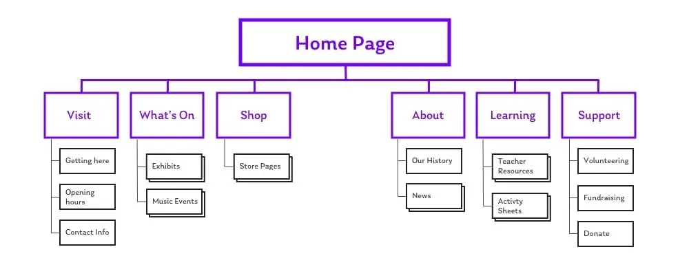 Information architecture for a simple website. Image from HubSpot
JavaScript and jQuery
JavaScript is a key web language that allows you to create websites. It was originally created as a way to make dynamic changes to a webpage without having to “talk” to the website’s server, but it has since grown into a complex beast that allows you to do pretty much anything. It’s one of the main front-end web languages alongside HTML and CSS.
jQuery is a JavaScript library that was created to make coding with JavaScript faster and easier. It allows you to use common pre-made functions rather than coding them yourself, but it can slow the website down because the function libraries must be loaded even if they aren’t being used.
JPG
JPG (also referred to as JPEG) is the most common file format for photographs and images. JPGs are great for the web because they can be optimised; meaning the file size can be reduced while still retaining good visual quality. They’re recently becoming overshadowed by the new WEBP image format, which offers the same benefits but at an even smaller file size.
Landing page
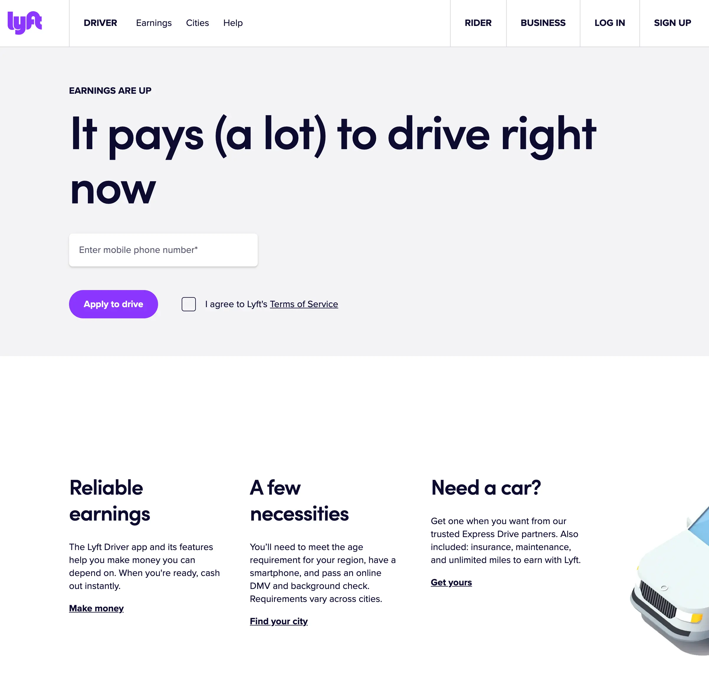 A portion of Lyft’s landing page, which is geared towards getting new drivers
A landing page is a web page that is designed for a single purpose, such as making an enquiry, signing up for a software trial, or downloading a piece of content. Everything about the page should push the user towards the intended goal, and optimised using conversion-centered design (CCD) principles such as clear call to action buttons, relevant, engaging, and enticing content, and appropriate imagery.
Here’s a ton of information on how to create a dynamite landing page design.
Meta tags
Meta tags are HTML tags that describe a webpage to search engines, which allow them to understand it, categorise it, and make it available in their search results. They are critical for SEO. The most important are:
- Meta description—a description of the page’s purpose. Google may show this underneath the page’s title in search results.
- Title—the title of the page, which appears in Google’s search results.
- Heading tags—these are used to define the structure of the page’s content. They include H1, H2, H3, H4, H5, and H6 tags.
- Robots—this tells search engines whether the page should be indexed and made visible in their search results.
- Canonical tag—if this page is similar to another on the site, this tag tells the search engine which is the “main” one.
Mobile First
Mobile First is a design methodology that starts with the mobile design, and then moves onto the design for other devices (tablet, laptop, and desktop) afterwards. This methodology is based on the fact that more than 50% of web traffic now comes from mobile,1 so it makes sense to start with the mobile design first, as this can allow you to create a better mobile experience.
Google is now putting even more emphasis on the mobile experience, and have just introduced a number of new metrics to measure it—Core Web Vitals. Check out the article to learn more!
Mockup
 A mockup of a very simple design
A website mockup is a visual representation of your final website design. It includes the colour, imagery, layout, and possibly the content that will appear in your final design, and allows the designer to get feedback from you before moving onto the development phrase.
MySQL
MySQL is a coding language that allows you to communicate with databases. It is the world’s most popular choice for website databases, and is used to create powerful and dynamic websites that can quickly fetch and send information.
Navigation menu
 eBay’s primary navigation menu, which uses product categories
Your navigation menu is how users find their way around your site. It’s usually a list of links that you can browse through, but can also be shown as clickable images, buttons, and more.
There are usually two main types of navigation on a website:
- Primary navigation—this is the main menu that is placed at the top of the website, usually in a navigation bar. It contains links to your most important pages, and allows people to navigate your website easily. On mobile, the primary navigation may be hidden behind a “hamburger” icon (three horizontal lines), which opens when clicked.
- Secondary navigation—this is a collection of links that are less important, such as a company’s policies, about pages, etc. They are usually kept in the website’s footer, or less commonly in a sidebar.
Open source
In the world of software, open source means that the source code of the software is freely available, and can be modified, customized, and re-distrusted. Letting any developer make changes to the source code tends to create a more valuable and error-free code, with WordPress a great example of this, having grown to become the world’s most popular CMS.
PageRank
PageRank is Google’s original algorithm that decides where to rank a web page in their search results. It’s based on the number and quality of inbound links to a webpage, and remains a ranking factor today (although a less important one).
PHP
PHP is a coding language that allows you to fetch information from a server, such as information stored on a database or within a file. When combined with HTML, JavaScript, and MySQL, PHP can be used to create dynamic, database-driven web pages.
Plugin
In the context of websites, plugins are pieces of software that offer useful features and functionality, which can be “plugged into” your website or CMS.
301 redirect
Every web page has a unique URL, and sometimes it changes. It might be changed to make more sense to the user (for example a more accurate page name), to improve the page’s SEO, or because the website is moving to a new domain.
Whatever the reason, when the URL changes, a 301 redirect is put in place for two reasons:
- To redirect the user to the new page—if the user tries to visit the old URL (say, from an old link or bookmark), they are automatically redirected to the new URL. This prevents them from getting a “404—this page cannot be found” error, and allows them to continue browsing your content.
- To update Google on the new URL—The redirect tells Google that “this is the old URL, and this is the new one,” which prompts them to transfer the old URL’s SEO ranking onto the new URL.
Refresh
When a browser loads a website, it grabs all of the information for the website in one go, and then presents it to the user. So to see any updates that may have been made to the website, you’ll need to hit the refresh button, which reloads the website by grabbing the information all over again, and “refreshing” it in the process.
Refreshing your browser is as simple as pushing a few keys on your keyboard:
- Windows: CTRL + F5
- Mac/Apple: Apple + R or COMMAND + R
Responsive design
A responsive website is a website which changes based on the device it’s being viewed on. Common devices are mobiles, tablets, laptops, and desktops, and a responsive site will switch layouts for each of these, to provide the best possible experience for the user.
RSS
RSS stands for Really Simple Syndication, and is a web feed that allows people to automatically receive content updates for a website. By subscribing to a blog’s RSS feed, you no longer need to revisit a website to check for updates, but instead receive it through an RSS reader. How intuitive!
Schema tags
These are a form of web lingo used by software developers. Schema tags are a way to write HTML code so that search engines can understand it better. They allow you to define the purpose of specific sections of a web page, such as whether the section is a product, place, or organisation. This gives the search engine a better idea of when to include it in search results.
Screenshot
A screenshot is a way of taking a photo of your screen, or a selected part of your screen. It then saves this onto your computer. These are handy when you are trying to show someone an issue with your site—instead of trying to explain the issue, you can take a screenshot and email it to them!
Here’s how to take screenshots:
- Windows: ALT + Prt Scr (Print Screen)
- Mac/Apple: COMMAND + shift + 3 (takes picture of entire screen)
- Mac/Apple: COMMAND + shift + 4 + select area (takes picture of select area)
Search bar
Websites can contain thousands of pages of content, which can be challenging for the user to find. The search bar is a way of quickly searching through the website’s content, which reveals a list of results and allows the user to quickly find what they’re looking for.
Because the search bar is such an important navigational tool, it’s usually found in the header of the website. Some search bars also allow a “pre-filter” option where you can select a category to search within, such as “Books” as shown in the example below.

Image from World of Books
Search bars can also show results directly underneath the bar itself, which you can browse without having to click “Search.” This is sometimes called an “AJAX search bar” in reference to the technology that allows you to fetch results without hitting search.
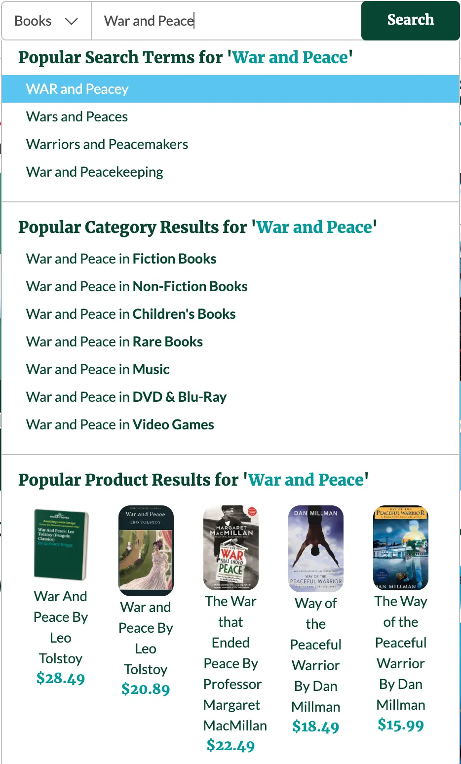
Search bar with AJAX dropdown. Image from World of Books
SEO
Search Engine Optimisation is the process of making your website more visible in Google’s search results. It’s a powerful and effective inbound marketing technique, which when implemented in the right way can produce lucrative results for a business.
To learn more about what to measure for SEO performance, check out our guide: 4 Crucially Important SEO Metrics To Track.
Session
As far as web lingo goes, this is probably one of the most confusing. When browsing a website, a session is the period of time that the user browses the website until they leave, and the things they do during this time. For example, you might land on a website’s home page, fill out an enquiry form, browse their blogs for a bit, and then leave the website. This counts as a single session.
The term is mostly used by web developers to distinguish one particular period of browsing on a website.
Sidebar
 A website sidebar on an e-commerce website, which uses it for product filters
A sidebar is a vertical strip of content that sits on the left or right hand side of a web page. They often contain information such as navigation menus, events, adverts, and calls to action. A common example of a sidebar is the one used in Gmail, which contains the various inboxes and chat feature.
Sidebars are less common on websites today because of the prevalence of mobile phones, which don’t have the screen space for them.
Sitemap
Sitemap means website map. It is the full list of pages on your site that are accessible to Google bots and users, which allows Google to easily understand the structure of your website.
They usually come in two types:
- HTML sitemap: Designed for the user, typically styled like the rest of your website. This page can be handy when users are trying to find a certain page or content within the site.
- XML sitemap: Is a structured format for SEO. It describes the structure of your site to search engines, how pages are related, and how often they are updated. Search engines love XML sitemaps!
Slug
A slug is the final portion of a URL after the last forward slash. For example, in https://www.mediaheroes.com.au/digital-marketing/seo/, the slug is “seo.” It usually identifies the purpose of the page, and also helps search engines to understand it.
SSL certificate (secure sockets layer certificate)
An SSL certificate is a digital certificate that authenticates your website’s identity, and allows an encrypted connection. It’s essentially digital proof that your website is secure, and adds an “S” onto the end of “HTTP” in your URL to demonstrate this.
SSL certificates help to protect the information of your users, both personal and financial.
Template
For websites, a template is a file that contains information for a web page, including how it is laid out, what content should be pulled in, and useful metadata. A template might pull in information from other templates to build the “complete” page, for example a separate header template and footer template.
A single template is usually created for every unique page layout. For example, if the layout of the home page is different to the layout of the blog (likely), each will have their own web template.
Tracking code
Tracking code usually refers to a small snippet of JavaScript that sends information to a separate tool, such as Google Analytics. It allows the separate tool to compile the data in useful ways for the user, such as how many people visited the website, how long they spent on it, and what device they used to access it.
Usability
For websites, usability is how easy the website is to use. When a website’s information is easy to understand, quick to find, and its features are clear, fast, and responsive, it can be described as having good usability.
Good usability is critical for a website because it creates a positive, memorable experience for them, and drastically reduces the likelihood of them leaving for a competitor.
User Experience (UX)
User Experience (UX) is a design methodology that focuses on creating a positive and meaningful experience for users. It’s a complex set of methods and practices that lead to a well-designed, usable website that people enjoy using. Some of its methods include:
- Usability testing—asking a user to complete a goal, and then viewing their actions to see where improvements can be made.
- Customer surveys—customer surveys allow users to provide long-form feedback on the website, which allows you to fix issues and make improvements.
- Customer interviews—as with surveys, customer interviews are one-on-one sessions where you ask the customer about their experience of the website, to discover problems and make enhancements.
- Card sorting—card sorting is a process that allows you to create a logical information architecture for your website, based on the user’s choices.
If you’d like to learn more, check out our article on the best UX tips and tricks to improve your website.
URL (uniform resource locator)
A URL is the address of a web page, and looks like this: https://www.mediaheroes.com.au/. It contains your domain name, and if you’re on a subpage, it usually contains a folder too, e.g. http://www.mediaheroes.com/digital-marketing/seo.
W3C
W3C simply stands for the World Wide Web Consortium (W3C). Having a website that is W3C compliant means that the written code has passed the standards set out by the W3C group—it is accessible by people with disabilities, through various devices, properly structured, and a whole lot more.
Web design definition
A web design definition is easy—it’s the design aspect of the process, where a web designer uses colour, typography, and other graphical elements to create your website, usually in design software like Canva or Photoshop.
Web hosting terminology
Web hosting terminology can be the most confusing of all! Every website needs a home, which is on a server (a computer designed to “serve” information to other computers) somewhere. Web hosting gives your website a home and allows it to be accessed by people on the web.
Web theme
A web theme usually refers to a pre-made website that can be purchased and used for a business. The theme usually includes the most important pages and features needed for a website, which can be quickly updated for the business and set live.
Web themes are ok if you’re wanting to get a quick website, but their code isn’t usually kept up to date with the latest SEO practices, so they can suffer in Google’s rankings. They also tend to be very basic, offering the bare minimum of what you need without any customisation.
Wireframe
In web design, a wireframe is an image that shows how a web page is laid out. It uses basic graphical elements to show what will be on the page, and where it will be placed.
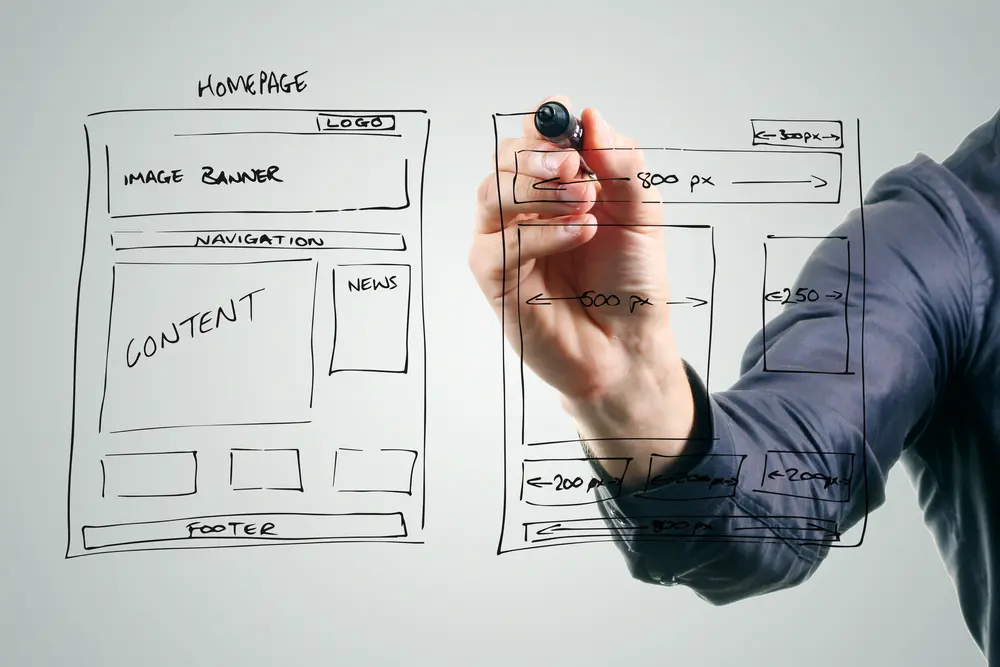 A wireframe for a homepage
WordPress
WordPress is the world’s most popular CMS. It provides a super-easy way for you to edit and manage your website content, and allows web developers to create highly customised websites.
That’s it! Your comprehensive, A to Z web design glossary. Now web terminology design doesn’t have to be so hard!
Web design glossary done!
You made it—phew! We hope our web design glossary helps you to better navigate the world of web lingo, and communicate more effectively with digital marketers and programmers.
References
- Mobile web traffic statistics, Think With Google
- • US desktop internet browser market share 2021, Statista.
- Maddy Osman, 2021, Blog Wild and Interesting WordPress Statistics and Facts (2021), Kinsta